VROOM GROUP ∙ 2026
Reimagining the car rental booking experience
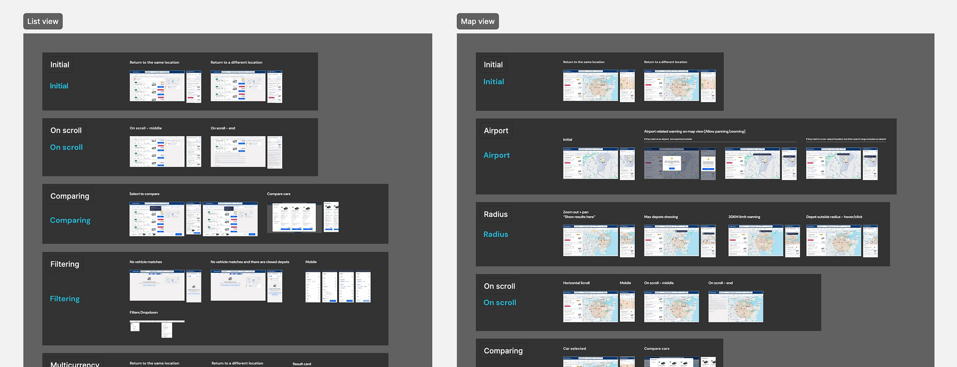
Responsive web
Conversion flow
Background
As a car rental aggregator, Vroom's booking flow is their core driver of revenue so any changes carried significant risk.
For this project, I led the redesign of the entire conversion funnel. From search form optimization to booking confirmation.
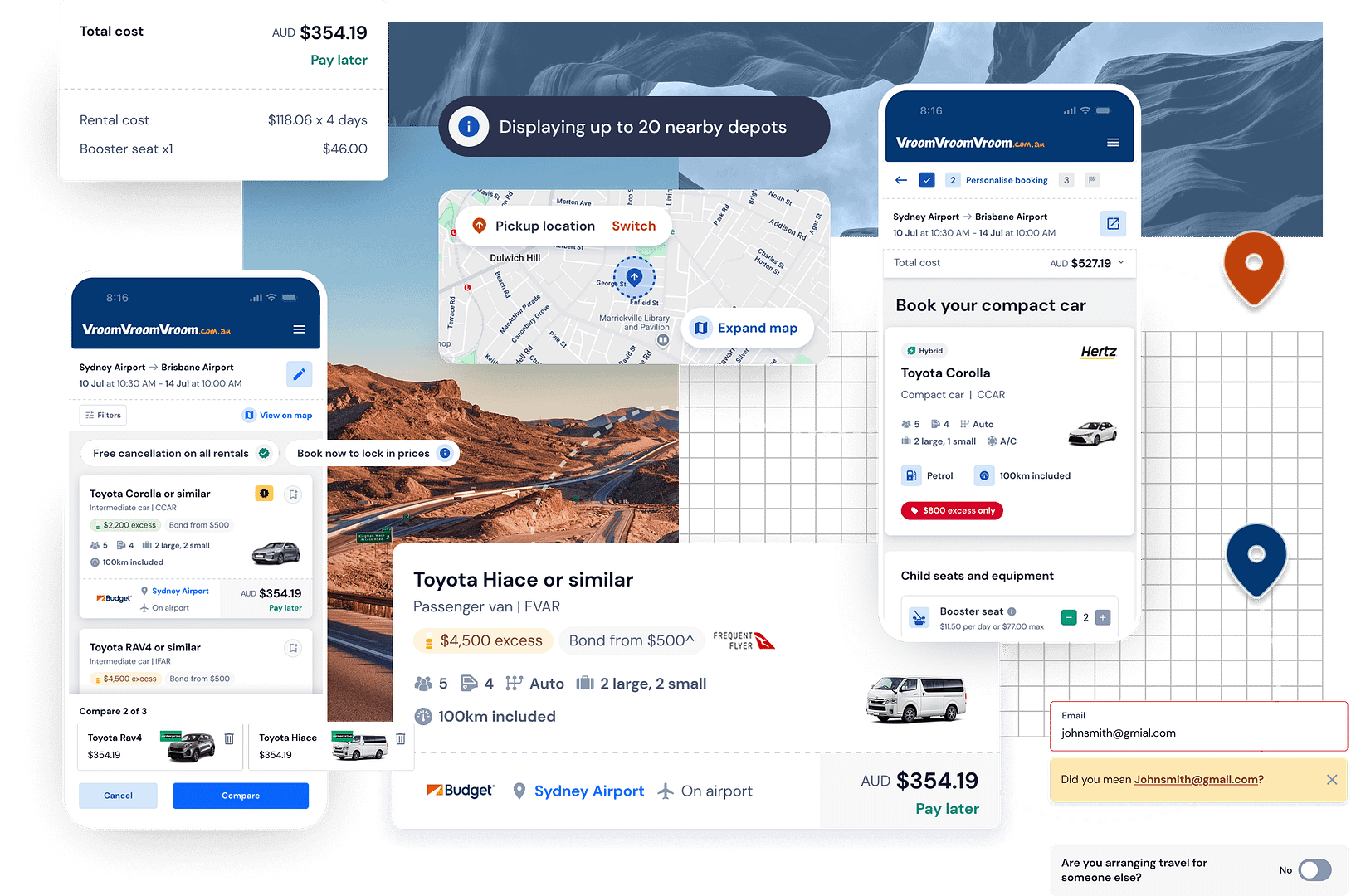
Shipped search form interactions
My role
What started as an engineering initiative to refactor the booking flow from legacy React, I saw was an opportunity to:
- redesign individual components for increased accessibility, and
- restructure the information architecture to support users' primary goals at each stage of the booking journey.
I was the sole designer collaborating with a PM, 2 front end developers, and a mobile apps developer to ship a full redesign across web and apps.
RESPONSIBILITIES /
Establish design direction for a cross-platform booking flow with the goal of increasing conversions.
OUTPUT /
Booking flow redesign on web and apps (iOS + Android)
TEAM /
PM, 2 front-end developers,
and 1 mobile apps developer
Challenges
There had not been any meaningful changes to the booking flow since before the pandemic.
So around 2023-24, when conversion rates stabilised to almost pre-pandemic levels at about 11%, management was understandably cautious about changes.
Vehicle page leakage
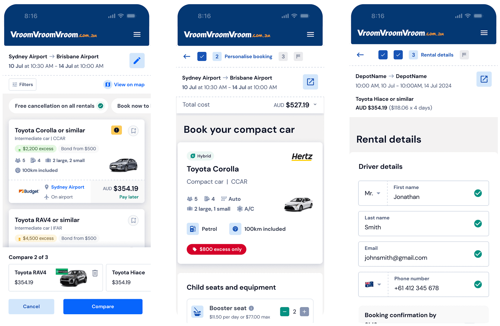
When I audited the funnel, the largest leak came from the vehicle details page. This makes sense as users are often opening and closing several tabs to compare options.
Designing around decision making
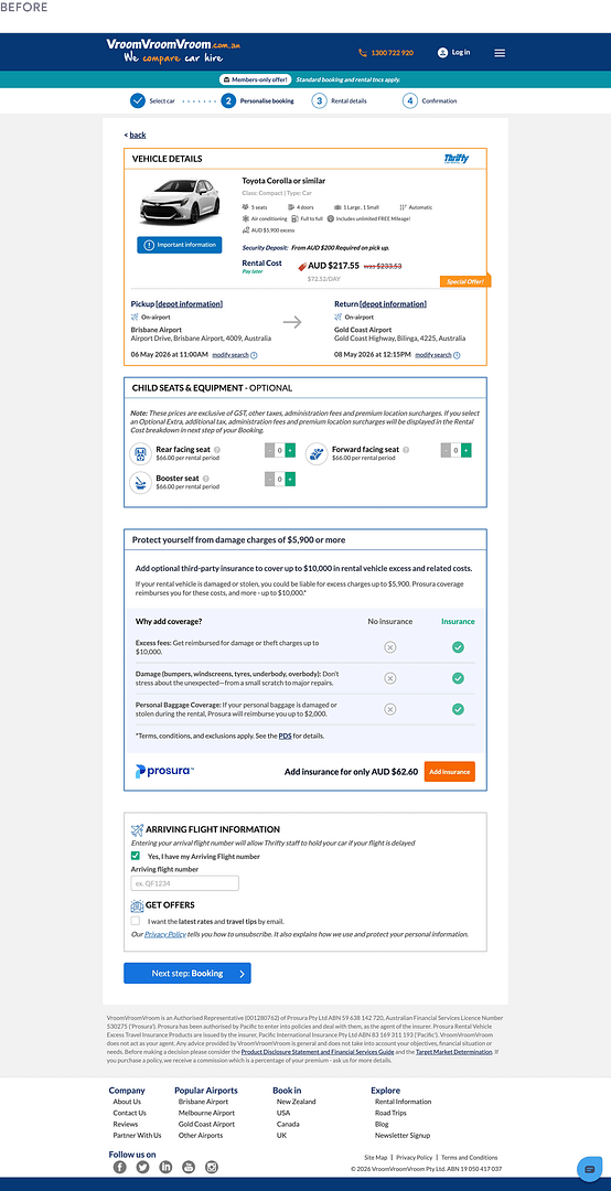
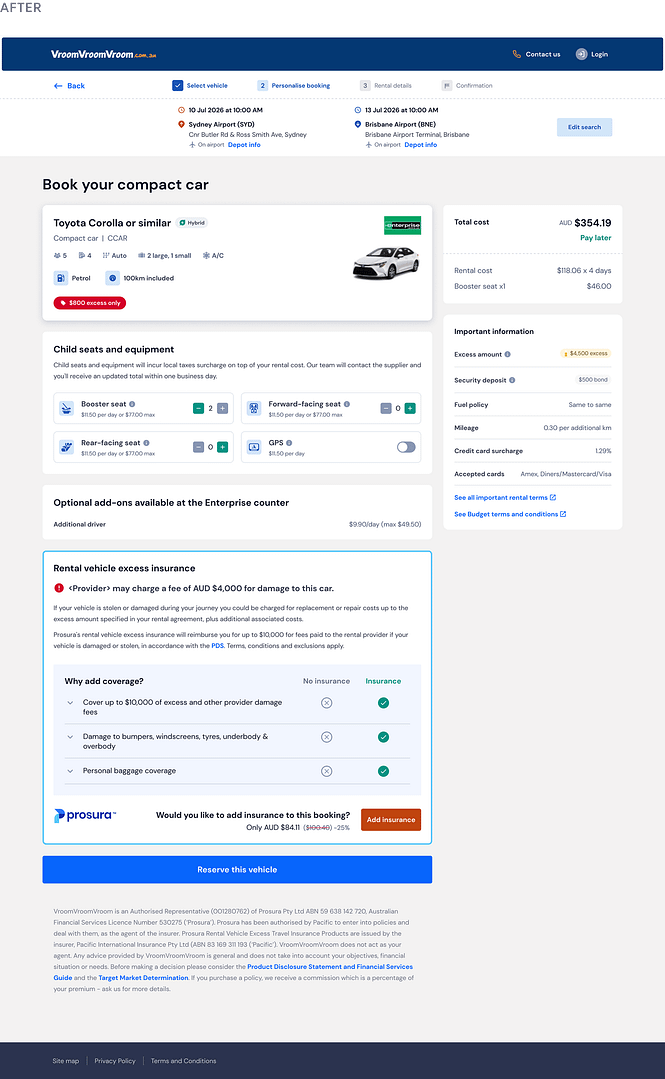
I found the interfaces weren’t really helping people decide. It was moreso showing every piece of information at once, rather than guiding users toward the key information they needed to make decisions at that stage of the journey.
Approach
I started by focusing on high-impact information hierarchy and accessibility improvements. I restructured content groupings to reduce cognitive load on the booking flow (even as parts of the flow still relied on legacy patterns), while also incrementally bringing design system components up to WCAG compliance.
Combating decision fatigue
Although the largest drop-off was coming from the vehicle details page, my PM and I found that decision fatigue was likely starting earlier on the results page.
So I focused on improving scan-ability and restructuring the results card around how users filtered vehicle options.
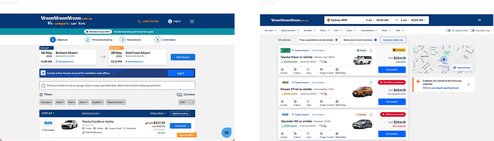
The restructure also increased the number of results seen above the fold from 1 to 3.
Reducing user errors
At the input level, I designed input-specific validation patterns to proactively reduce common user errors such as email and phone number.
Pilot program
To de-risk the roll-out on the main site, we ran a pilot program on one airport partner and one secondary brand. Here, the redesign led to a 27% increase in conversions.
With stronger gains coming from mobile (30%) where I prioritized the critical input steps to reduce confusion.
+27.2%
YoY uplift in conversion
Compare → Commit → Book
Outcome & retrospective
01/
+27.2% YoY uplift in conversion with no new features
Without adding any new features, we achieved a measurable increase in conversion by improving accessibility, restructuring the information architecture, and aligning each stage of the booking flow with the user's decision-making process.
The resulting uplift in conversion gave the business confidence to roll out the redesigned experience to all users.
(Will provide updates in Nov 2026, 6 months into the official launch).
02/
Did we need a pilot program?
The redesign touched nearly every stage of the booking funnel. While individual changes were low-risk, the cumulative impact of restructuring search, results, vehicle selection, and checkout introduced significant uncertainty.
Rather than releasing globally, we launched to a limited segment to answer two questions:
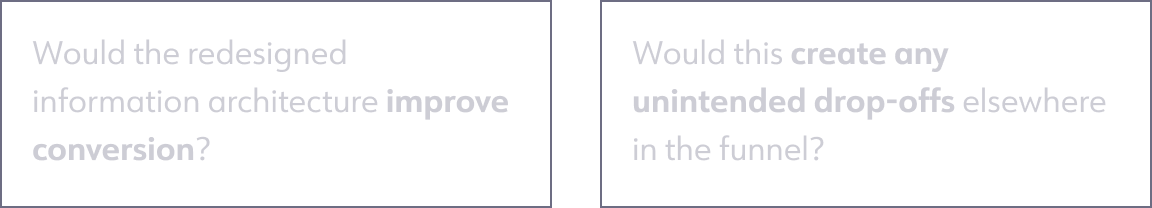
The pilot allowed us to validate the new experience against a stable 11.2% conversion baseline before committing to a full rollout.
03/
Key learnings
IA can have as much impact as new functionality: The largest gains came from restructuring and prioritizing information around user intent BUT...
User intent changes throughout a funnel:
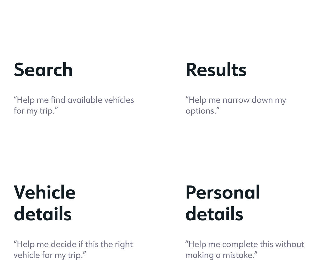
Designing each stage around the user's immediate task allowed us to reframe the flow from a series of screens into a sequence of decisions that we could support through the interface.
💌OPEN MAILBOX
ALEXINE MARTINA ©
Made for alexinemartina.com by Alex
