[REDACTED] Telecom ∙ 2018
How to recognize & reward employees in large companies
Mobile app
Enterprise
In my time as a designer for enterprise platforms, HR approached us with an ambitious project.
Employee recognition had been an ongoing issue in the workplace. (HR heard about it plenty in exit interviews). I was to lead the UX/UI design in the multi-department project team tasked with finding a solution.
Disclaimer: All views expressed here are my own and do not necessarily reflect the views of the respective company.
My role
I was in charge of all major UX deliverables such as end-to-end user flows and a working prototype on Adobe XD.
As the sole designer, I was effectively the representative of every employee. I would regularly walk-through my designs with stakeholders and the team. I worked with the UX Architect in developing the information architecture, as well as the Tech Lead in managing what was possible within the confines.
As the dev work progressed, I created a design fidelity assurance document for our third-party developers to ensure the actual product remained faithful to the design vision.
RESPONSIBILITIES /
User research, ideation, end-to-end prototype, design fidelity assurance
Timeline & OUTPUT /
2 months to design a mobile app for iOS and Android
TEAM /
Project Manager,
UX Architect,
Tech Lead,
Business Analyst,
HR Managers (2) and,
Third-party Developers (6)
On the environment
Empathize
In order to empathize with the users, I had to define my understanding of the environment. The team had conducted numerous nation-wide surveys & user interviews I could use as a research foundation for understanding employee thought processes around work ethic and recognition.
2018
We did have a program for giving kudos points to co-workers, but it was web-based. And in this fast-moving telco, web-based might as well be called "useless."
In fact, it was found that 62% of employees prefer to do work on mobile devices, and so it was fitting that our new recognition platform take the form of a mobile app.
Employees didn't care for the current recognition program, and neither did their supervisors. Employees just didn't see any value in a point-giving platform.
Telecom culture
Company culture isn't something that's manufactured in an executive meeting room. In our case it wasn't the average of employee personalities either. It was the edge cases—a trend set by a group I'd like to call the pace-makers.
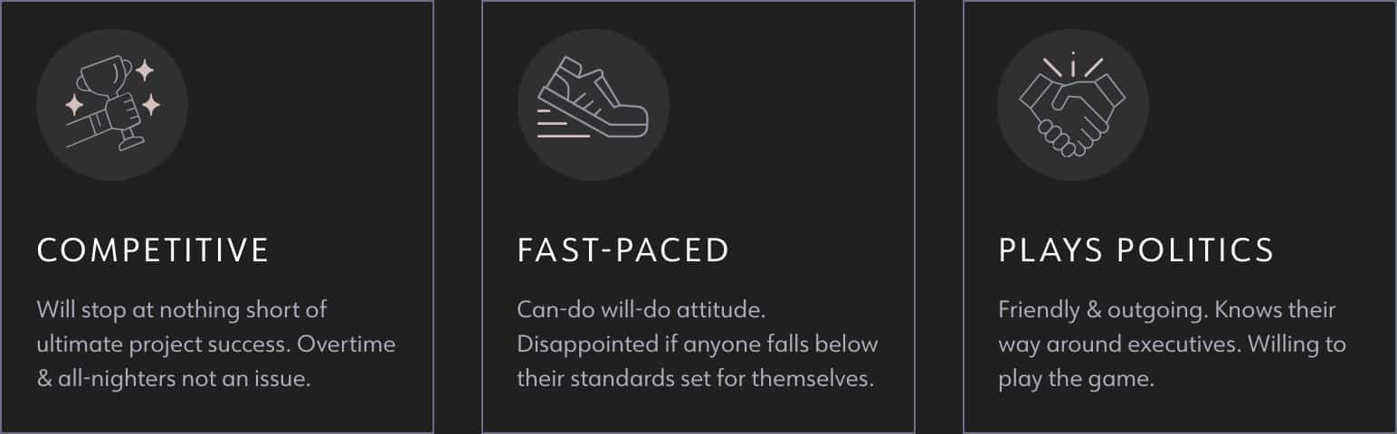
Interestingly enough, these traits were also the most common "cons" for ex-employees on just about every job-seeking platform out there.
The culture was always very cutthroat and competitive. BUT, we found a way to use that to our advantage (more on that later).
Recognition factors
Defining the factors involved in employee recognition helped me understand why employees needed to be appreciated in the first place. Recognizing that their motivations were more emotional than material would be crucial in informing my design decisions.
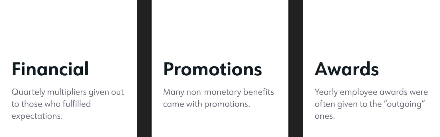
01/ Physical factors
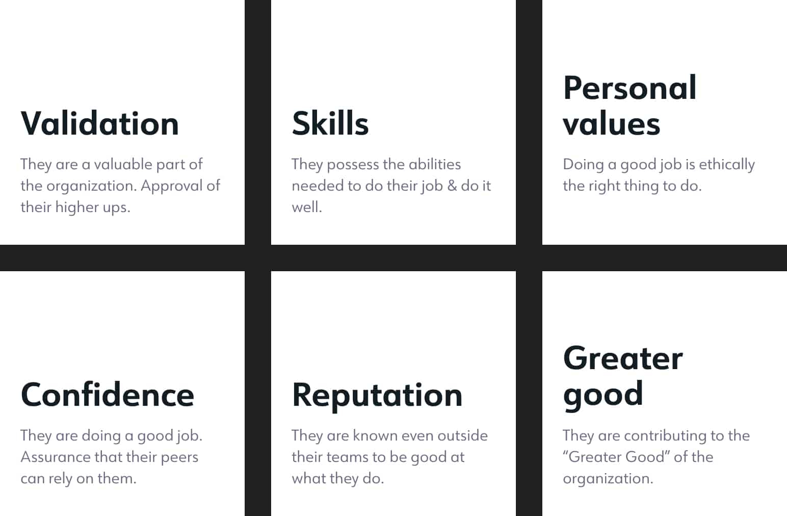
02/ Emotional factors
Defining the problem
Problem statement
Employees are in a highly-competitive environment, often working with totally different people for every project. Their managers and colleagues only see the finished product, not how well they fulfilled their role nor the amount of hard work they put in.
Design challenges
Inclusive design
I was designing for all 30,000 employees, accounting for anyone between the ages of 20-60. A fresh graduate, all the way to a legal senior citizen.
Make it "fun"
Work-related apps were plentiful for the average employee. Getting noticed would require a unique approach. The solution would have to engage a wide variety of people with different occupations, interests, and values.
It's not about me
I was in a unique position of designing for a user-base that included myself. Which is awesome. I just had to keep in mind that my feelings about work do not necessarily reflect anyone else's.
User stories & POV
The team decided that a point-giving system would not be enough to sustain interest, and so we focused on value-adding functionalities that aligned with our project goals.
We would be delivering the app in phases, with each outcome informing the next. Phase 1 focused on the foundation of the app. Give & receive. The next phase would require the structure established over time with phase 1.
Phase 2 would be introducing a "Team view" for people managers, as well as a company-wide leaderboard. This was where we planned to deliver meaningful changes to the way recognition was perceived throughout the company.
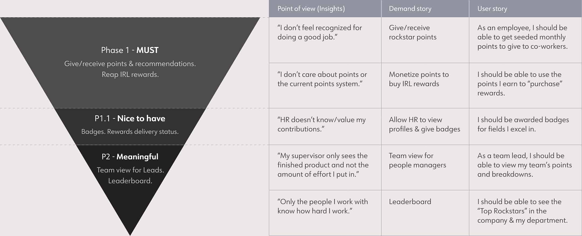
A simplified version of the Demand Stories/User stories (DSUS) document. Turning points into a currency would be vital for incentivizing use of the app.
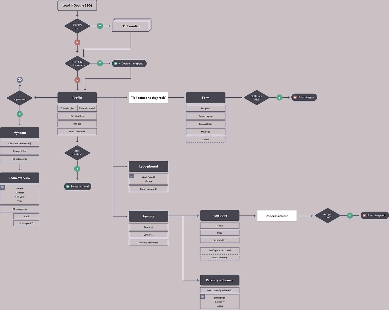
Flow with the go
Weekly alignments with the project team educated me on the needs of the business. This gave me a starting point to quickly generate user flows and organize information on the app.
Being able to map out future phases helped me ensure screen designs were scalable.
Iterations & adjustments
I went deep into exploring several ideas as I struggled to meet all users in the middle. The confusion is evident in some of the earlier interfaces.
I can pinpoint the exact moment my design nerve kicked into high gear. I was at a weekly alignment with our design lead when she said, and I quote, "Alex. It's boring."
That's when I decided f*ck it. What is the whole office into right now? (The answer was Candy Crush & Pokemon Go). Okay. I can do that.
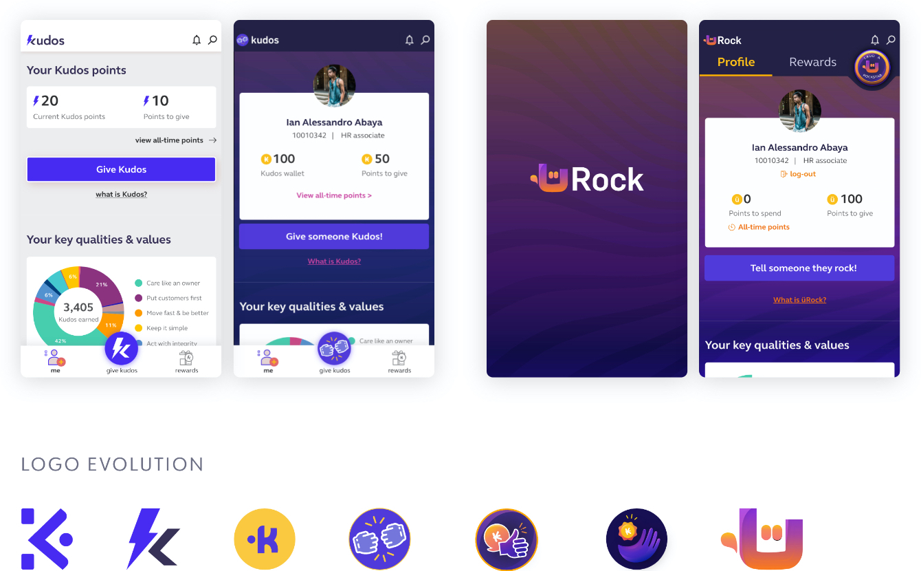
The logo evolution should give you an idea of how many times the UI was rehauled over a period of 2 months. As I gained confidence in the decision to go all-out on the visual design, waves of color slowly made its way into each iteration.
Truth is, you’ll never please everyone. The best you can do is create an experience that is usable and helpful. Meeting everyone in the middle is just going to give you a drab, lifeless product.
"A wild usability finding appeared!"
Iteration 12 had been "the one." The project team had scrutinized it, and then loved it as I revised it to adhere to the technological constraints communicated to me.
Separately, us designers conducted a usability test for layouts on web and mobile. Users who fell under each employee persona were timed as we asked them to identify elements on a wireframe. This was to validate if our layouts were inline with their expectations.
Layout validation
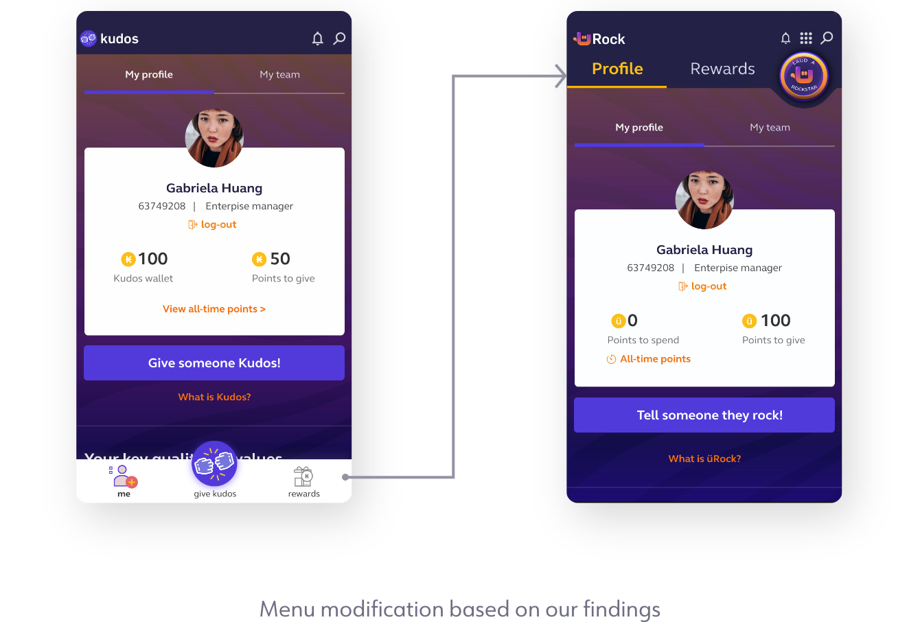
Users would be shown wireframes similar to this. As an example, they would be asked to point out what they thought was a main menu or secondary menu. All other layout items passed but one.
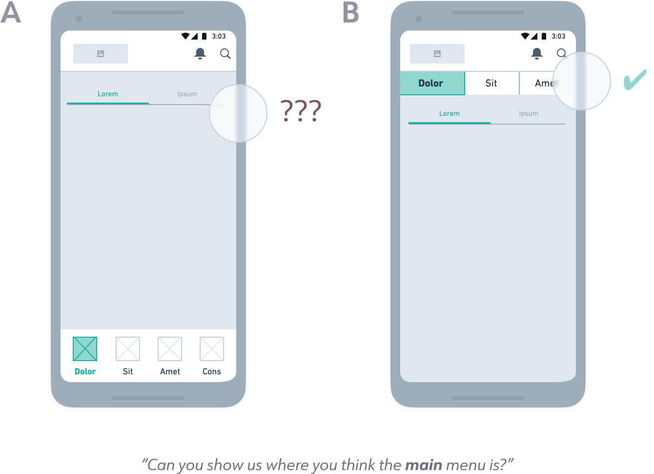
With layout A, users struggled to distinguish which one was a primary or secondary menu. A lot of apps today use layout A, but we understood where the confusion was coming from.
You can argue that the bottom-menu-with-tabs option is a staple in mobile app design. When combined with UI, there would be a clear distinction between a primary or secondary menu. However, some of our more complex enterprise apps had more than 5 main pages.
Not only was layout B a safer option in the long run, but having a consistent layout would also put less strain on users to learn new work apps. Not to mention streamline design and dev work as we could re-use layouts for multiple projects.
Communicating with the team
Every time something was tested, I explained the results to the greater project team. In this case there was some push-back, but in the end the menu modification made it into the current sprint.
That is ultimately the goal as a designer: to represent the user, but also to convince development teams and stakeholders that your designs adhere to proven best-practices.
From fist bump to rockstar
The app was originally symbolized by a fist bump. But as the demand stories evolved, so did we. A fist bump is more akin to camaraderie, a casual acknowledgment to an equal. But ROCKSTAR? That sounds like someone to look up to, someone who has stepped up to their role and claimed their unique abilities.
Designing solutions
Start with goals
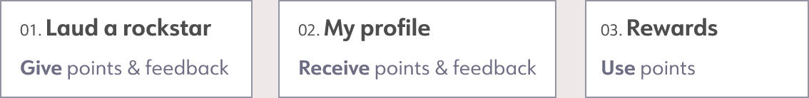
This was one of my favorite projects to design. Foremost, because its meaning was so straightforward. Give and receive. Something so pure and fundamental (and you can’t spell fundamental without FUN).
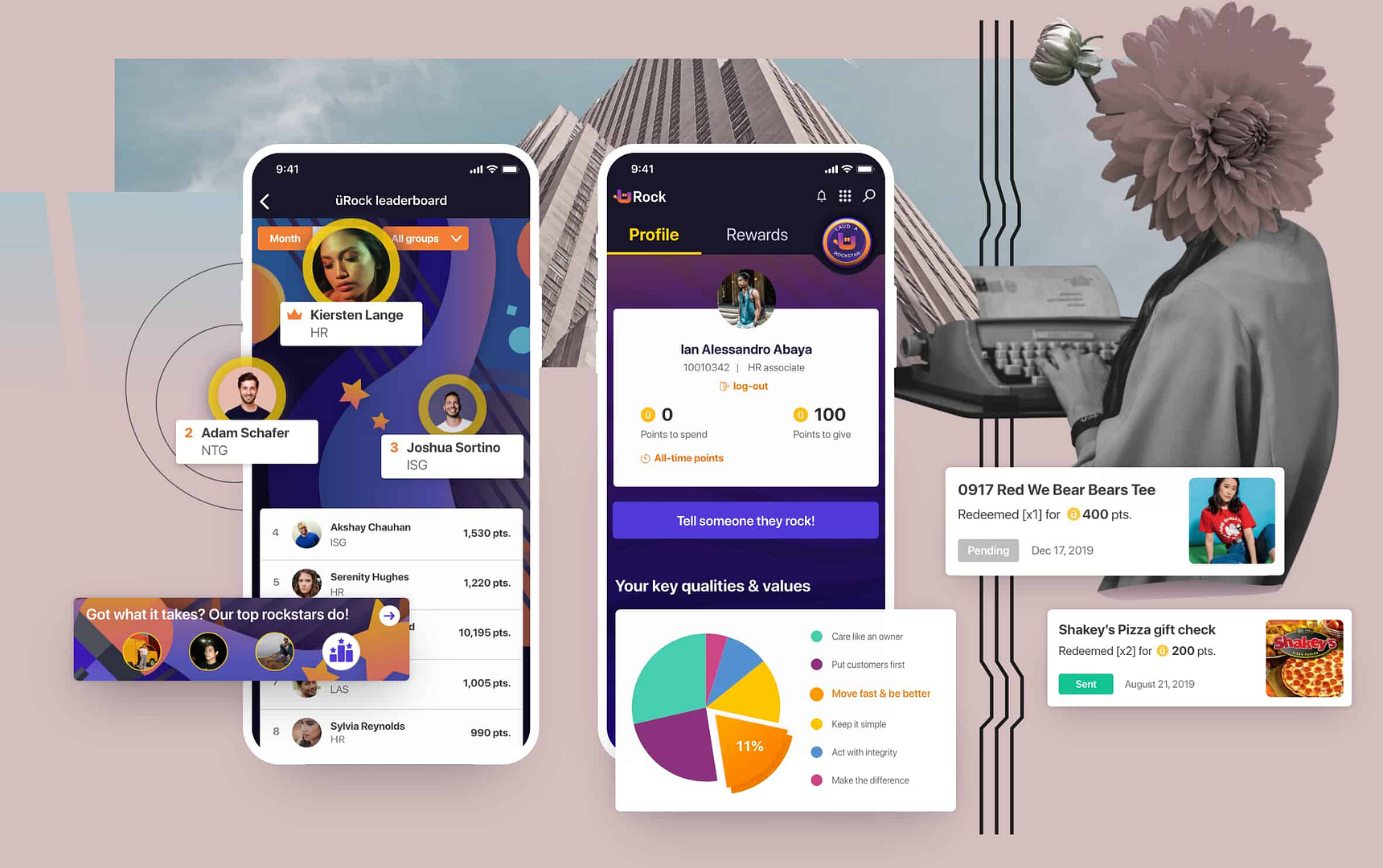
üRock's first phase had 3 primary screens that corresponded to the 3 primary user goals:
You can't give what you don't have
The first screen a user sees after SSO log-in is their user profile. First-time users are onboarded and then automatically seeded a hundred points to give (PTG). 100PTG is given every first day of the month, with a maximum of 200PTG if they don't give them away.
As the name suggests, they can't spend these points. Points to give are exclusively for co-workers they think have done a good job.
Empty states — instead of blank sections with blurbs, I opted to design something a little less boring.
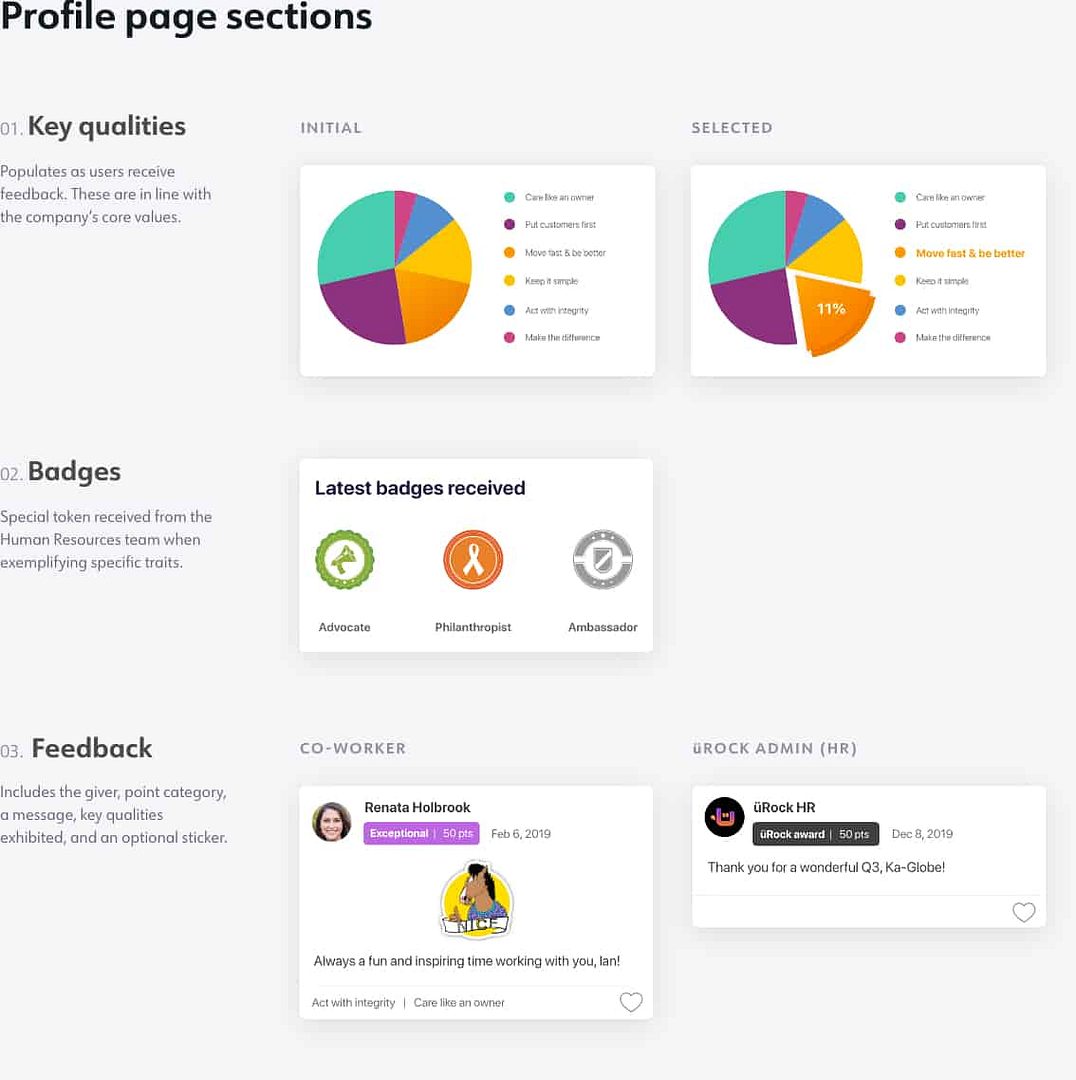
Laud a rockstar
Rockstar points are not made equal; the giver must choose the type of points to give. Since users are seeded just 100PTG a month, there is more weight when giving "Exceptional (50 pts)" over "Thank you (5pts).
Text complies with WCAG 2.0 contrast standards at level AAA. Checked against all colors used in the background.
"Those who give receive more"
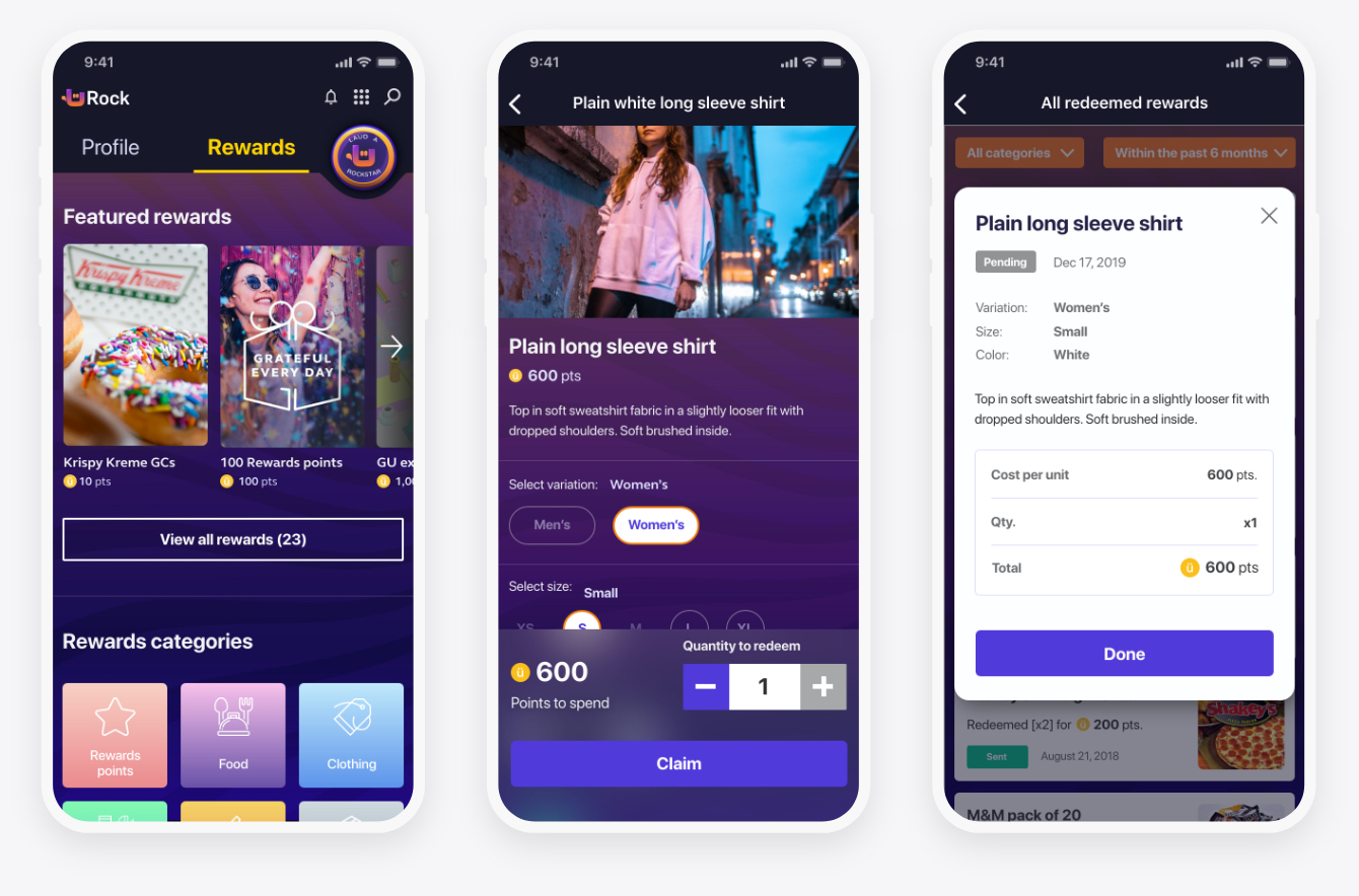
The rewards page is where a user can spend their hard-earned points to spend (PTS). They get these when other co-workers laud them for being an outstanding teammate. It's fairly straightforward e-commerce. There's a store, product pages, delivery statuses, and a redeemed rewards history page.
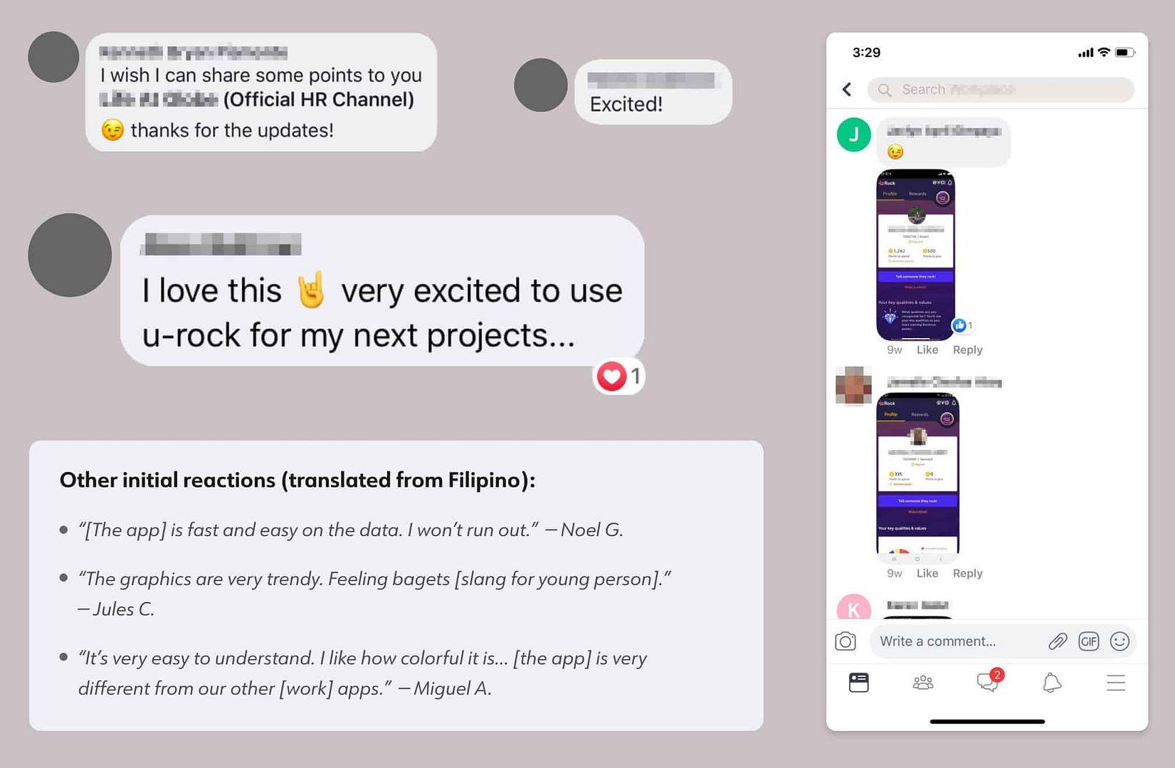
FIRST RELEASE
The MVP was released and the team rejoiced. We read comment after comment on the speed, usability, and visual charm of the app on Workplace.
Our adoption rate goal for the first month was 12-15%. The actual was 18%. However, an overwhelming amount of comments were users sending screenshots of their profile page. Because what is the point of doing a good job if no one else knows?
Enter phase 2
What does it mean to be a rockstar? Rockstars exude confidence & share their talents, but most of all they are recognized for it.
We have an app for an employee to give and earn points, as well as a way to gain rewards. What now? At this stage, it was just a point-giving app. It still wasn't solving the bigger issue of recognition beyond their project teams.
We had to think back to what made our company ethic unique. What drives us to come to work and give it our all? What is the method by which the physical and emotional recognition factors mentioned above are obtained?
Competition. (Told you we’d be coming back to this).
In an intense and rapid work environment like this, you can bet everyone loves a little fair and friendly competition.
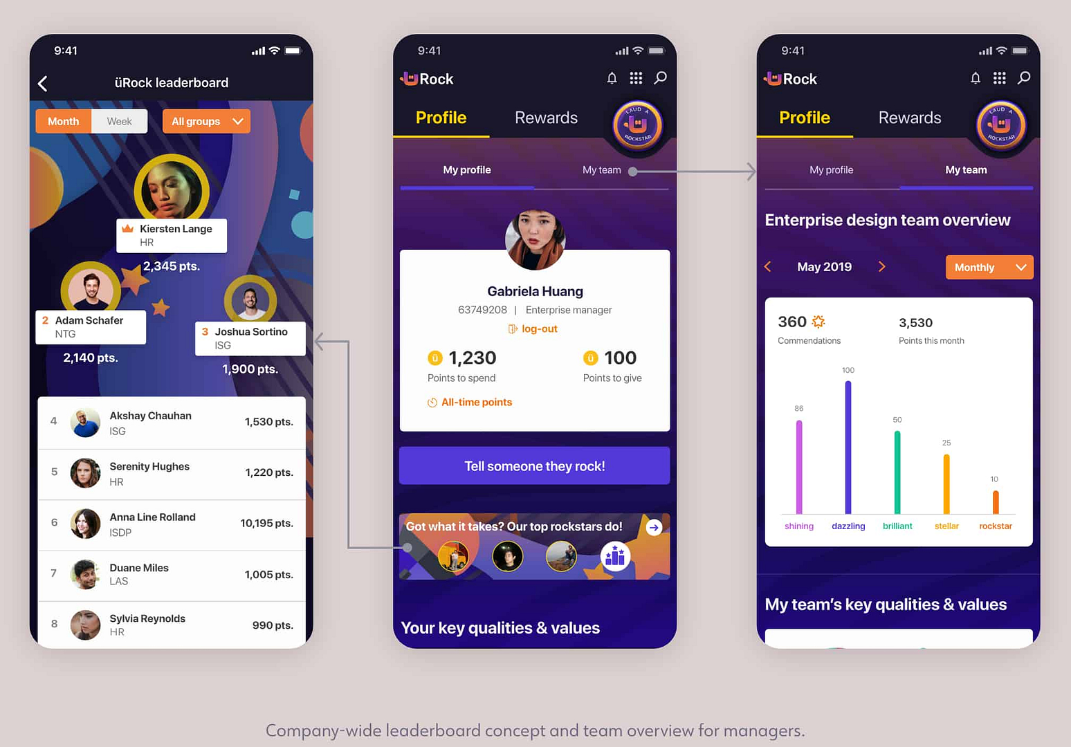
Leaderboard
The next phase would include a company-wide leaderboard with the option to see who the top people in your Group are. This would be updated every week.
Team view for managers
People managers would have a dashboard for the accumulated feedback of their direct reports. This is to keep track of their team's progress, possibly even a way to open up a conversation when they see a drastic change in stats.
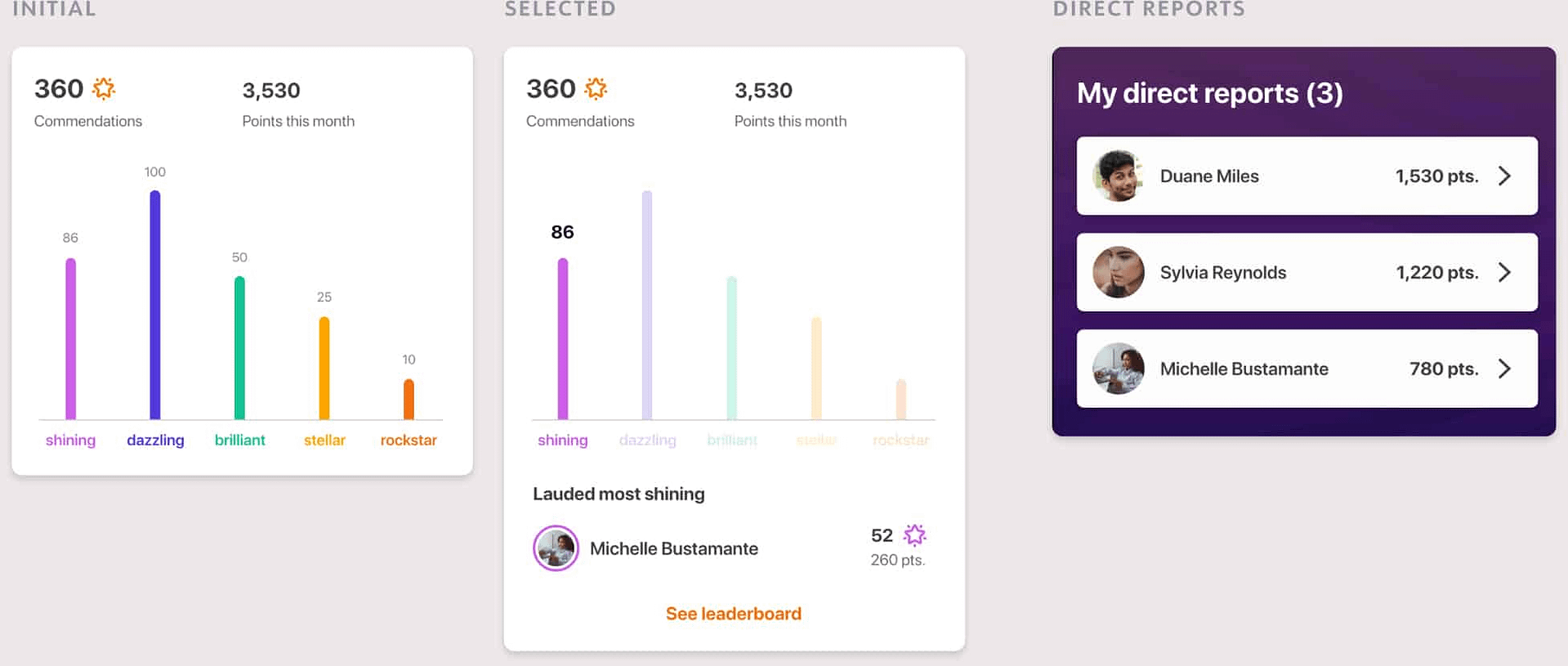
Commendations are the total number of times a direct report was lauded by a co-worker. Similarly to the profile page, there are statistics on which key values the team exemplified over a certain time period. Managers can also view their direct report's profile pages for more in-depth feedback.
These features would allow managers to more accurately make adjustments not only based on their direct report's output, but also their attitude and commitment within their individual project teams.
Aftermath & retrospective
01/ THE AVERAGE IS NOT REAL
Should I be designing for the typical user or the edge cases? Well, it depends. Our metrics can give us an average of thousands, but if you take all that and turn it into a person, who would they be?
I'm grateful to have been with a team that prioritized user interviews and usability testing. The company is full of such unique characters that no data could possibly quantify in a couple of numbers. Meeting one-of-kind, passionate individuals from the same demographics changed the way I look at analytics and user data.
02/ BUTTING HEADS
I constantly got into disagreements with one other lead on the team. We argued about what was the best type of interaction for every element, all the way to font-size. It was intense at times, but I appreciated it because I knew I was working with someone who cared about the success of the product just as much as I did.
Those are the kind of people you really want to be working with.
I learned to let go of my arguments when it no longer applied and to compromise where it mattered. Constant communication is the spirit of Agile.
03/ Third-party developers
Every time a version was sent out for testing, I would do my own rounds after the QAs. It was a lot. Mostly layout and styling issues as these were not viewed as high-priority.
Enterprise applications do not generate revenue. I was praying for Jira, Asana even, but all I had was Google Drive services. I had to make do.
I started off sending screenshots on Google Slides with descriptions and red arrows or boxes. I realized quickly that this was not working. I had a lightbulb moment as the developers were presenting their prototype to us, going back and forth from the user stories document.
I decided to make my own document, connecting issues and user stories with XD screen links. Lists, instructions, priority levels, screenshots, videos—the whole lot. It was an expectation vs reality meme in Google Sheet form. Best part? You could see progress happening live.
It worked. The dev team was responding to it. It worked so well that our design lead asked that all other designers use my same design fidelity assurance document from then on.
04/ The end
Unfortunately, for reasons unrelated to the project team, the app was pulled and put on indefinite hold before phase 2 ever went into development.
Such is life in enterprise. Whole projects are halted by invisible hands. Project teams disbanded in private and exclusive conversations.
I did what any young designer would do: quietly emailed the highest people I had access to and asked. The reason was solid. There was nothing anyone could do. I was incredibly disappointed.
Still, what I learned about working with other departments out of IT would be invaluable over the next few projects. It was my first time working with a dizzily diverse set of users, but I had an amazing team to back.
We had a good run. They'll always be rockstars in my book.
💌OPEN MAILBOX
ALEXINE MARTINA ©
Made for alexinemartina.com by Alex
