TITAN22 ∙ 2018
Building a seamless shopping experience across platforms
Mobile app
Website
E-commerce
In 2016, the outcome of our total website overhaul was better than we could've dreamed. Two years later, I got the call.
The company was ready for its first-ever mobile app. I was to design it solo, with support from the same team I started my career with. More than just an "app version" of the site, it would be their tribute—a means of honoring their commitment to their most loyal of customers.
Disclaimer: All views expressed here are my own and do not necessarily reflect the views of the respective company.
My role
I was there at the conception of Titan's new online experience that began in 2016. I was a young college girl trying to establish a career in the Digital World—at any capacity. I encountered a persistent centripetal pull to get my hands dirty in the online space. Looking back, it could have been destiny (or something less cheesy).
I was partnered with the Business Manager for Digital and Brand Specialist to establish a new Digital team. As a trio, we navigated the world of online retailing, suppliers, and business meetings as we lay the foundation for what would eventually become the new TITAN22.COM.
I felt my work was complete sometime after we launched, and so I left. Then in mid-2019, I was approached by the same Business Manager, now Director, to design Titan's mobile app.
I took the lead in UX design tasks and decisions including user research, product design, and design fidelity testing.
ROLE /
Product designer & UX consultant (freelance)
TIMELINE & OUTPUT /
Responsive web design
Mobile app [ skip here ↳ ]
TEAM /
Director for Brand Innovation (former Business Manager for Digital) and,
Brand Innovation Associate Director (former Brand Specialist)
It all started on the web
We spent our days as a team planning, aligning, going to business meetings, and building the site from the ground up—all For Love Of The Game. This part details the creation and conception of the original e-commerce site, upon which the app was built.
Design challenges
The website’s design base was completed in 2013. Only in late 2015 was the re-design project eventually mobilized. This left me with the following challenges:
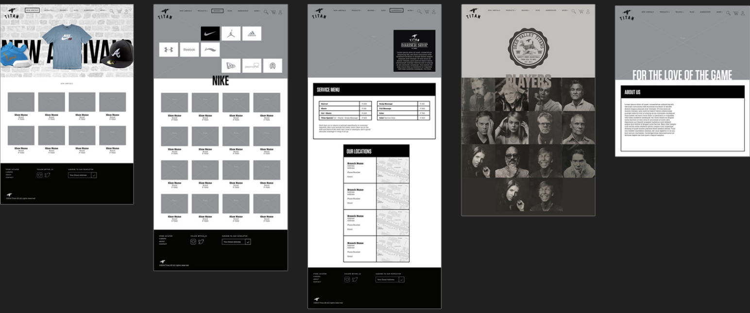
Fleshing out wireframes
This would involve populating the website with meaningful copy and imagery. Measurements and style-guides would need to be developed for consistency.
Building & integrating additional functionalities/pages
How could I ensure that these contributed to expanding the user’s relationship with the brand? (This would come in clutch later).
The site was not optimized for mobile
At this point (early 2016), 9-21% of orders were made using a mobile device even if the site was not responsive. 11 months into migration, purchases made on mobile had increased to up to a third of total orders.
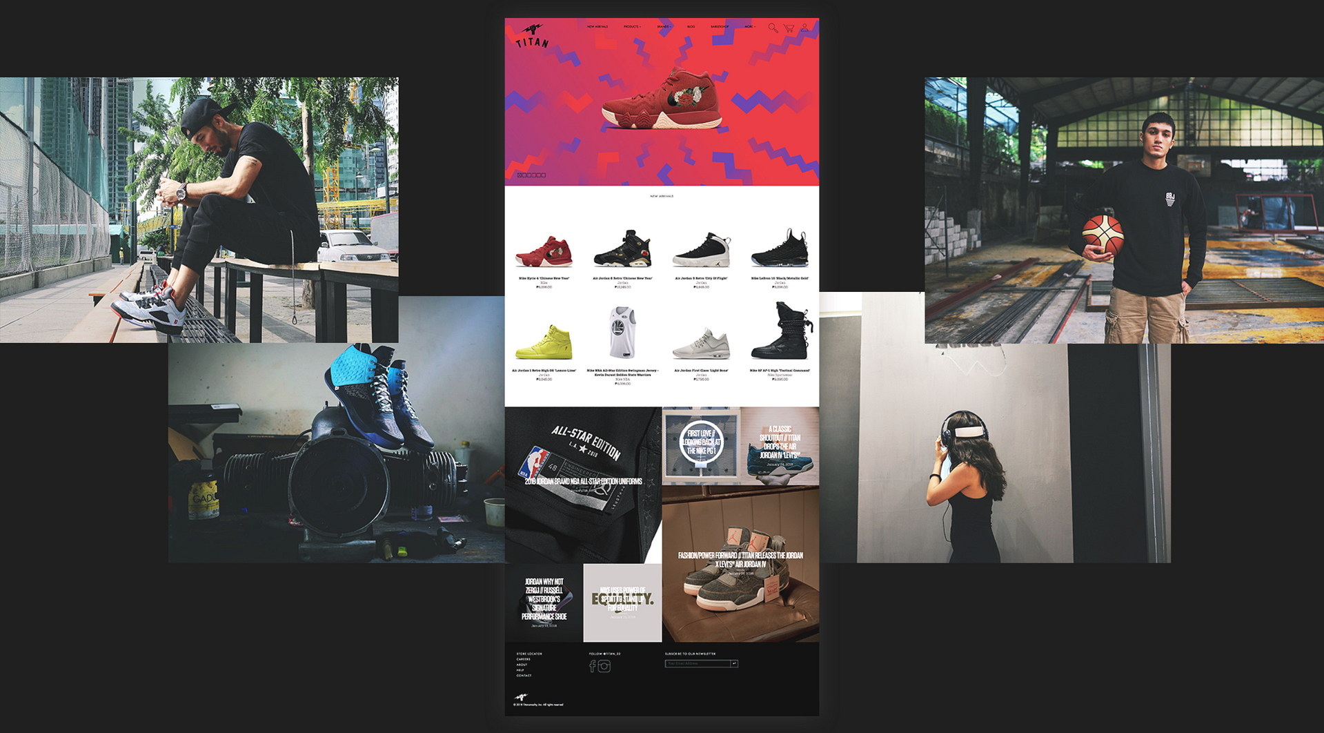
The original web wireframes served as a foundation for the website—all with the brand new Titan identity.
This is how we shaped the Titan e-commerce experience into what it is today, eventually dominating as THE flagship store of the business— experiencing strong and steady growth since the new webstore was released.
Website & branding overhaul:
the aftermath
The site was relaunched in mid-2016. Within the first 6 months, site revenue had already gone up a considerable amount, eventually above 80% by 2018.
As an online store, the cost of up-keep is nowhere near as high as that of a physical store. And with growth so quick and unprecedented, it was only a matter of time before the webstore rose to flagship status.
AND WITH THAT, WE'RE BACK IN THE PRESENT
The website and mobile app, at least in the beginning, would share a large part of an already established customer base. We needed to find a way to do things better, to make the mobile app experience special.
The demographic we wanted to target were the patrons: brand loyalists who would line up for hours before opening hoping to get on the next big drop.

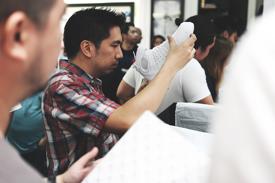
Patrons in Hoops Haven
The Philippines is a Basketball Country. From the churches to the wet markets, basketball is everywhere.
Making an app for an existing platform is tricky because your user base has already been established. It’s like talking to the same people, but you’re changing the conversation.
This was our chance to make it about them.
All hail analytics
Our first course of action was getting to know our users. Thankfully, Google Analytics gave us an obvious starting point to begin our research.
Here are some quick findings:
👨🏻 The majority of customers are adult males living in Metro Manila, aged 21-35.
However, the largest percentage of site visits came from the 18-24 age group. It was perhaps, just purchasing power that was lacking over an actual desire to obtain products. Also, around 20-25% of purchases were made by return customers. This was a comfortable number for the team, as well as further validation for creating an app to support existing users.
 Provincial shoppers made up around a fourth of total purchases.
As of now, there is only one brick-and-mortar store outside of Metro Manila, and it is an outlet.
⏰ Average time to checkout was short, meaning customers already have an idea of what they want before entering the site.
Short checkout times could mean two things: either the customer already knows what product they want, or they decide very quickly.
What were their pain points?
Finding yourself redesigning your own project is a strange, humbling experience. It was important I acknowledge all the ways I could have done better then, as well as understand that even the slightest hint of subjectivity now would be unacceptable.
I grabbed 5 self-proclaimed basketball shoe collectors between the ages of 18-25 and went on with user interviews. Here are some of the insights gathered:
01/ ON USABILITY
Cover images — I regret to inform you about a 60-100 view height header image, which I swear was all the rage in 2016. Every time your results page refreshed for say, a filter, there it was.
Shoe size availability — The only way to see the specific sizes available for a product was to go into the product page, click the size input, and scroll.
Pagination — The image-heavy site already took some time to load. The results page used pagination, meaning every time they went to the next page it would load a new page. (Yes, with the cover image on top).
02/ ON MOTIVATION
"Usually I use [the webstore] just to check what is available at the real stores.”
There is no denying the instant gratification of being able to bring home a product on-the-spot. What the app lacked in "realness" it had to make up for in convenience.
When something is out-of-stock at a physical store — The webstore was a backup, in case something was unavailable in an IRL store.
"I live far away" — This one was expected, and not a bad motivation. The app, like the webstore, would have the benefit of being everywhere at once.
"No one likes lining up" — One participant explained that he preferred shopping online due to the convenience of not having to line up or talk to people.
03/ OTHER CONCERNS
This is the part where participants were asked about whether they were aware of certain features, functionalities, and activations, and how they felt about them.
Release communication — The main social media touchpoint was Instagram. This was where releases were announced. As is a common issue, posts tended to drown in the crowd.
Reservation program — Titan Reserve (previously Titan RSVP) is an online product activation where special releases with limited quantities could be “reserved” online. Most were aware of the program but never bothered to try.
"It's always the re-sellers that watch out for it and just post it on [redated] groups like—double the price."
This was a problem because the program was meant for customers who truly want the product for themselves or a loved one. It was meant to be sold at a certain price and not inflated to sometimes ridiculous proportions.
The new mobile app would be an opportunity to address these issues. It was like a second chance. We could utilize smartphone capabilities and provide a more concise shopping and check-out process.
A smarter homepage
Context is everything when you're going for such a minimalistic style. What matters to basketball shoe connoisseurs? The next big thing.
I decided to start it off with a featured section.
This would involve 3-7 cards with images, descriptive text, and a call-to-action to allow the digital team to set the context. What is important today? What should users care about? These would set the tone for the rest of the user experience.
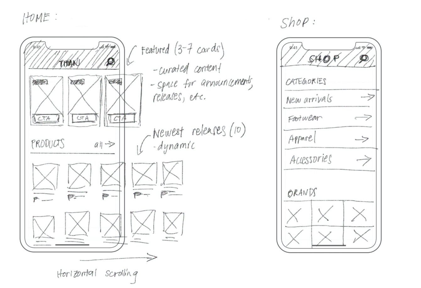
Horizontal scrolling has the benefit of being a very natural gesture on a mobile device, as well as saving vertical space so users only need to scroll on sections they want to.
Images on the outer right edge are "cut" to signal horizontal content.
A new home: a one-thumb experience
Newest product releases are displayed in 2 rows that fit comfortably in a viewport and move as one when scrolling.
Designed for speed—this was meant to be the app equivalent of browsing through a clothing rack.

Unified results page
The idea was to streamline the many results pages on the webstore. So why not just have one single results page?
The product category could be changed on the top bar. I also included horizontal filters which were arranged by importance. Users could filter for size here.
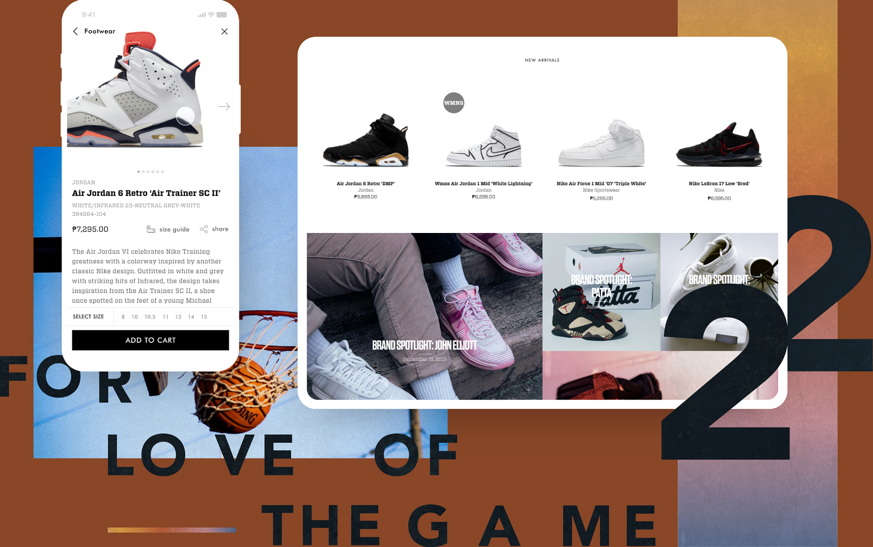
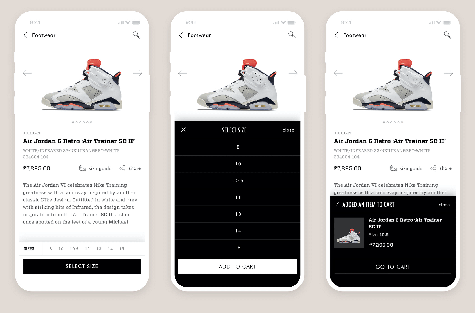
Product page
All available shoe sizes are displayed on the product page itself. This ensured that even if the user did not filter by size on the results page, they would still be aware if their size was available.
There is no quantity selection for shoes. This is intentional friction to deter hoarders/re-sellers from buying off entire stocks.
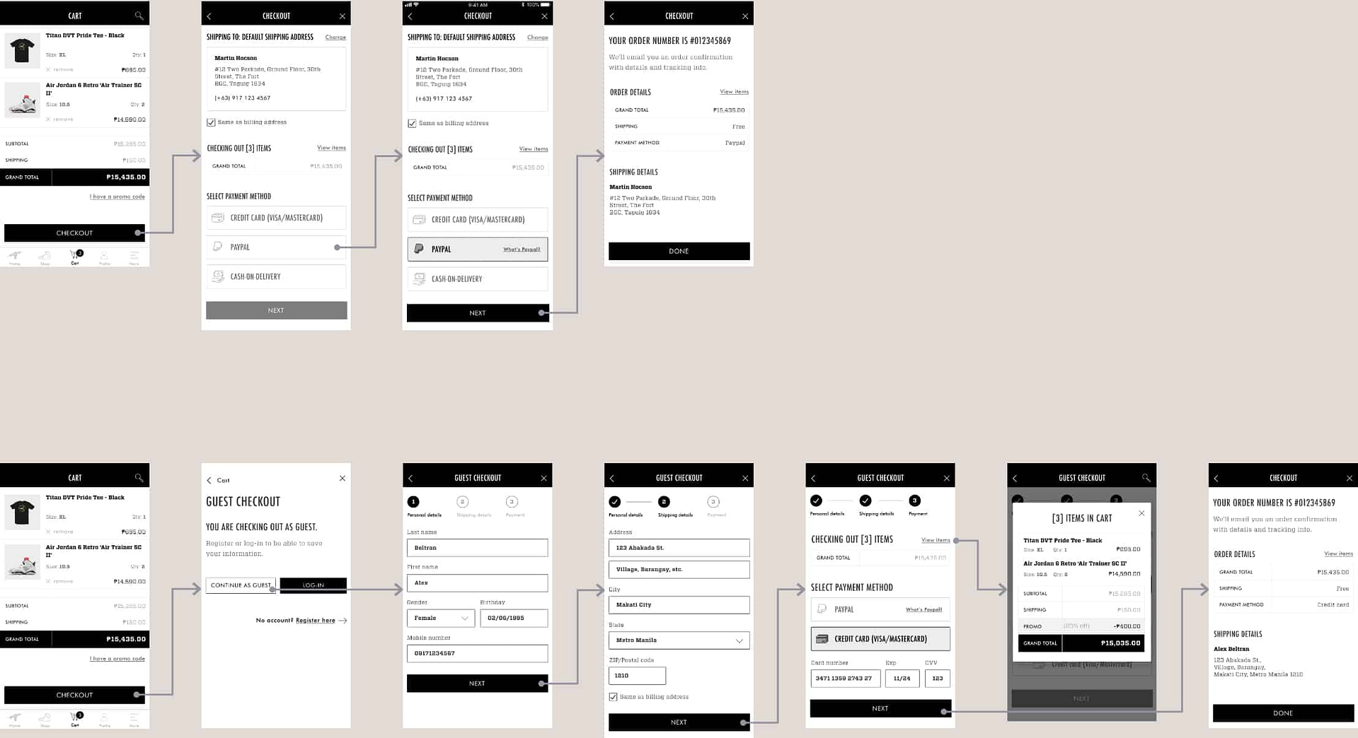
Checkout flow
The fastest possible flow is if the user is logged in and pays through either Paypal or cash-on-delivery. Guests are encouraged to log in or sign up with the promise of being able to save information for quicker checkouts.
Other features
Sorry webstore, these are app-exclusive functionalities.
Titan ID
A Titan ID is applied for in-store. It's used to earn points and avail of special discounts. A customer would need to provide their phone number and a valid ID (the latter was often forgotten).
A phone however, is always with you, so the app was perfect for this feature. A profile would contain information entered during sign up, such as mailing address and shoe size.
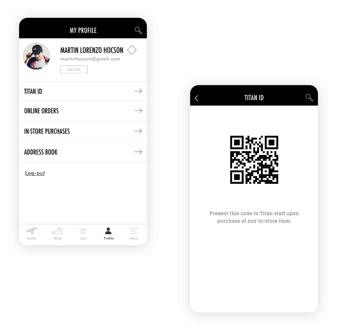
As the account is verified with a user's mobile number and email, identity fraud becomes less of an issue when collecting points or purchasing reserved items. Store staff can scan the code at the cashier, and the customer is good to go.
Utilizing location services
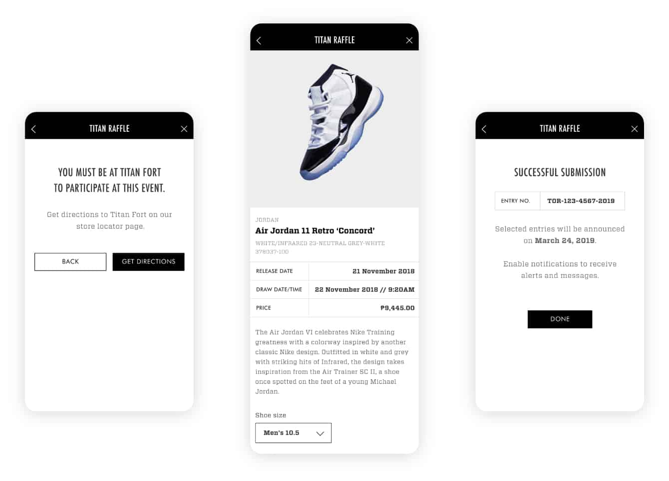
Titan Raffle is a new in-store product activation (an event to promote & quickly move a key product). But unlike the Reserve program, you have to be in-store and have a Titan ID.
If location services detects a user isn't at the location, the app will promptly tell them how to get directions.
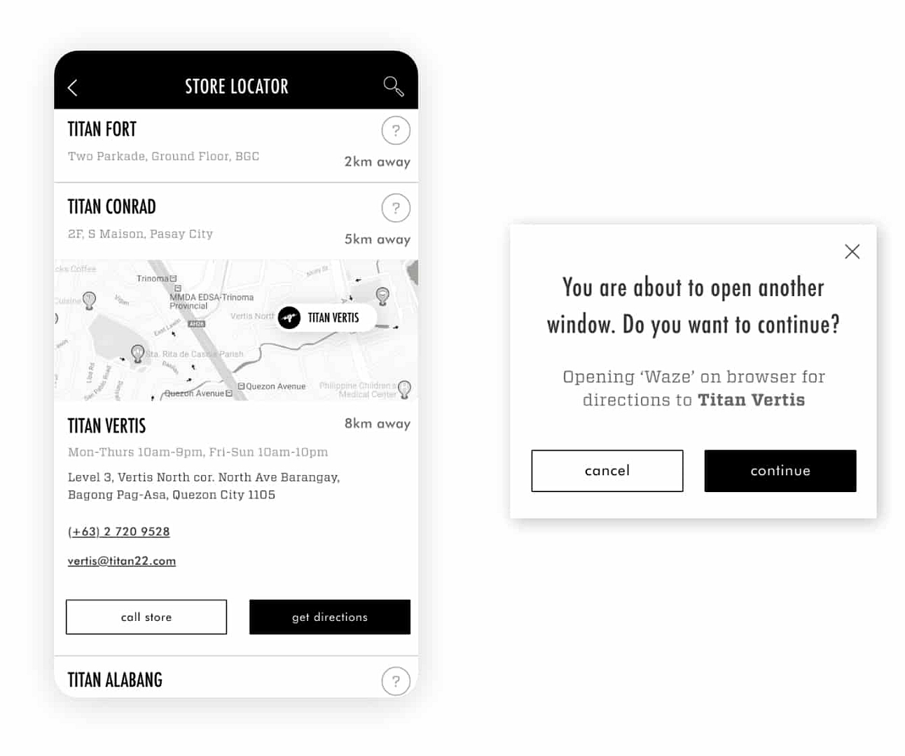
Help, I need directions for the Raffle!
The app has a store locator page that can immediately get the help needed with Waze. It contains information on how far a user is from a store (as long as location services are on), as well as store contact information.
It is always arranged by distance from a user so they can get to their store-needs straight away.
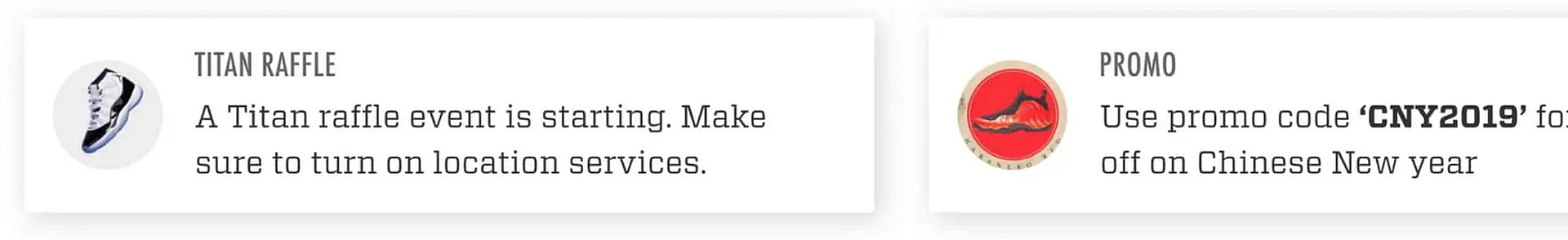
App notifications
This eliminates the need for brand communication through Instagram. With the app, a user can receive important announcements like promos, event updates (Reserve or Raffle programs), and of course, if they win a product at these events.
Retrospective
What I would've done differently if I knew what I know now.
At the time (Oct 2019), I had just started with enterprise and had mainly been working on web platforms and dashboards.
This was only the second app I've ever designed. I have a couple of takeaways, all of which would be important in the months to come as I started delving more and more into app work at my regular job.
01/ contrast
"Color is power."
I am more aware now of the tools out there to guide designers in increasing accessibility for color contrast (based on W3C standards). All text to background contrast must be at least 4.5:1, or a AA standard.
Nowadays, Brent Jackson's Colorable is one of my favorite tools for contrast checks, along with the Stark plugin for XD.
02/ FONT SAFETY
I would have made the argument to replace the main paragraph font to a system font.
Vitesse is a beautiful font, and it works on the web, but not on mobile apps. I had to manually adjust the kerning for every font-size instance to make it readable. Custom fonts can be amazing and give-off brand presence, but the argument on loading times and legibility must be made.
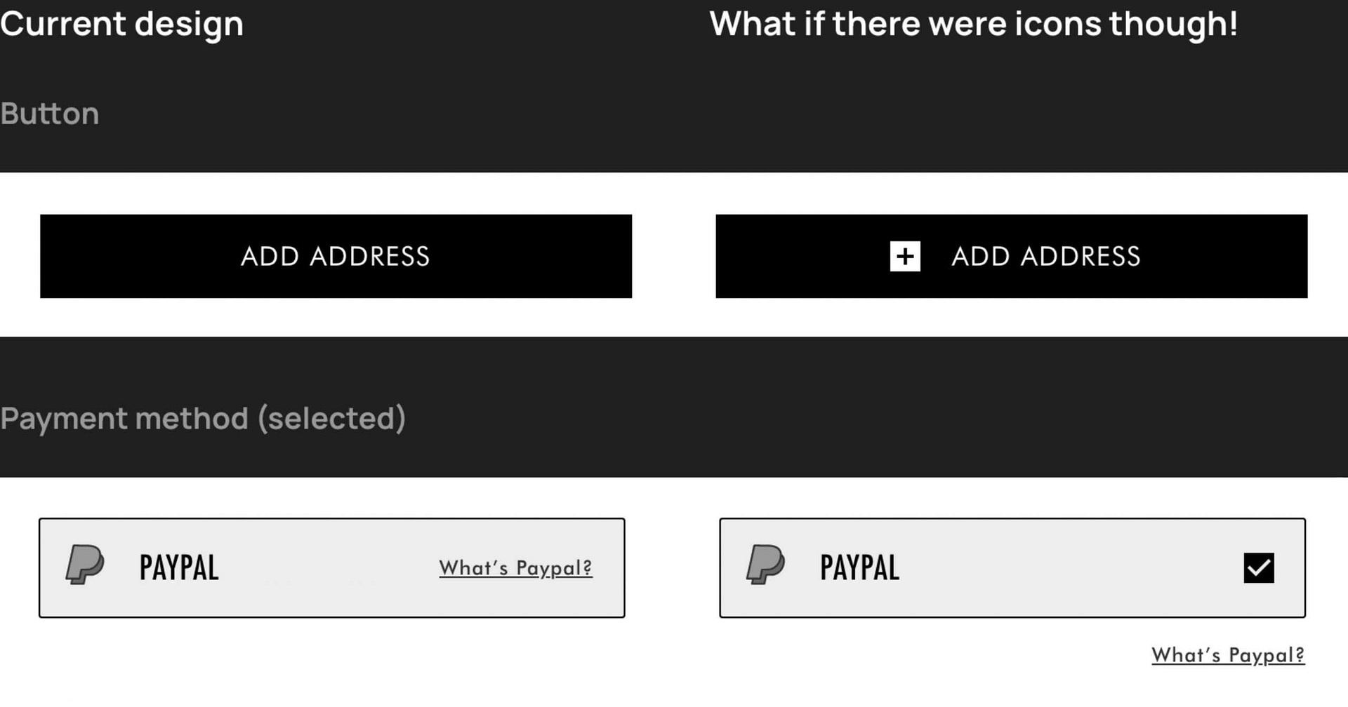
03/ MORE ICONOGRAPHY
As the app is black-and-white and minimalistic, I realize it could have done with a few more icons to further indicate certain functionalities. For example:
04/ Closing
In 2016, Gia and Ray set the standard for how I understood the word "team." I'm still very proud of what we accomplished over these 4 years, from the website to the new mobile app. I'm also very happy to have worked with such wonderful people, all of whom are very passionate about both The Game and the Digital Space.
💌OPEN MAILBOX
ALEXINE MARTINA ©
Made for alexinemartina.com by Alex
