[Redacted] Telecom ∙ 2019
Connecting professionals through learning events
Mobile app
Enterprise
The largest corporate event of the year was fast approaching—and our current event app did not have the infrastructure to support it.
The team had decided that our check-in app was un-presentable in its current state. This was not going to be just a re-design, but a complete overhaul. I took ownership of creating a new product experience that better represented our company.
Disclaimer: All views expressed here are my own and do not necessarily reflect the views of the respective company. Some design elements have been changed from the original.
My role
I was responsible for everything UX: user flows, prototypes, as well as the app's new visual expression. The works.
As mentioned, we did not have the luxury of time (or money for that matter). The team was made up of just me, an App Developer to code the product, and an Engagement Specialist to guide us on the ins-and-outs of company events.
It became clear from the very first discovery session that this was going to be a leader-less project, with each team member taking full responsibility over their arena of expertise. If they needed something from me, they got it, and vice-versa. I had 3 weeks to design.
RESPONSIBILITIES /
Discovery, ideation, user flows, end-to-end prototype & testing
Timeline & OUTPUT /
3 weeks (no joke) to design a mobile app for Android/iOS
TEAM /
App Developer, and
Engagement Specialist
High-level goals
01/ Make it accessible
Large events can be messy. Event-goers needed something to guide them before and during events. It also had to make sense to non-native English speakers.
02/ Incorporate event activities
Events would include learning sessions and workshops to be managed on the app. It was crucial that our solution influence users to sign-up for activities unrelated to their fields.
03/ Give users a sense of their skill progress
How might we let users know that they’ve progressed in a certain direction or topic? How might we give them a sense of accomplishment?
04/ Enable event-goer to expert interaction
We wanted to streamline the Q&A process so that it could go on without a "host" as multiple activities could be happening simultaneously.
Let's talk context
Understanding the environment in which the app would exist was vital in setting the specifics of each user's journey through the event. Due to the time constraints, I had to rely on proto-personas and my own real-life experiences in attending our company's events. (Not ideal, but necessary).
Who's attending?
We used the guest list to inform our assumptions on the app's expected users outside of the company. This along with discussions with the Engagement Specialist provided the data we needed to create proto-personas and prioritize features to support them.
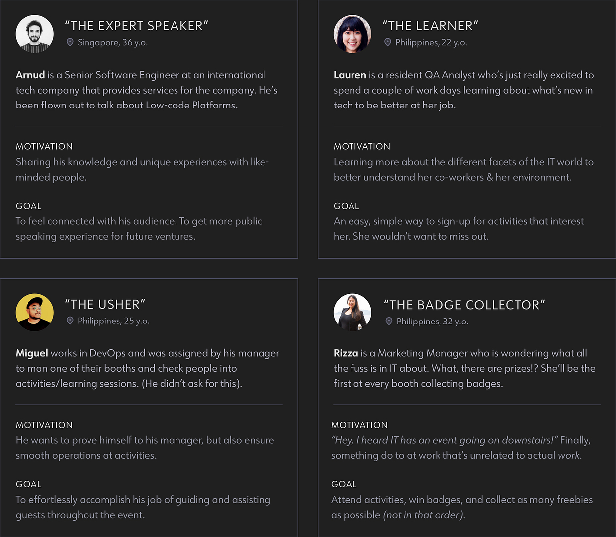
The last three are an amalgamation of 6 actual co-workers I had come in contact with during my time in The Telecom. This made for better experience visualization and empathy on my part as I gauged each of my imagined co-worker's reactions at certain touchpoints.
Most guests and speakers would be employees of the company and after this event would likely become the sole users. We needed an app that could continue to grow with us even after the event was over. This meant a structuring it in a way that could de-scale to accommodate smaller corporate gatherings.
Visualizing connections
I decided to go with a simplified service blueprint in order to present the entire event flow at a high-level. This would prove to be time-efficient, as well as effective in demonstrating persona-to-persona interaction.
Lauren and Rizza's personas have been combined into just event-goer for a more general approach, as all user types would be able to participate in event functions.
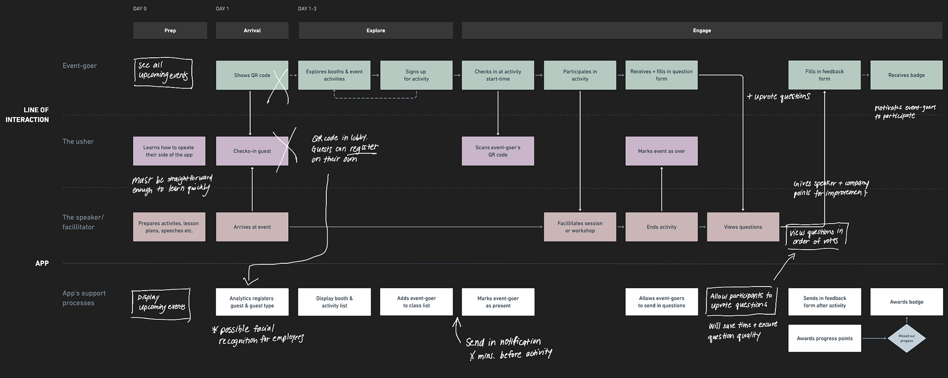
The white notes represent enhancements as the team approached the end of development and realized we had just enough time to do better. We added value with features like notifications and allowing upvotes at the Q&A portion.
We also decided to completely remove usher responsibilities at the registration stage. Event-goers could simply scan a QR at reception so they could begin exploration the minute they arrived.
I enjoyed working in this fluid development environment where each team member was hyper-aware of the entire experience we wanted to create. Our excitement allowed us to approach each new idea with full dedication. We could assess the current user flows as a whole, making it easy to find and minimize gaps in the process.
Don't make me think
I relied heavily on iconography and visual cues to communicate possible courses of action. Event guests hailed from 9 countries on 4 continents. Accessibility and inclusivity were a priority.
The decision to go with a wildly colorful background was made for the sake of brand presence. I balanced it out with white cards and solid colored backgrounds for the inner pages, making sure colors and typography met the highest accessibility standards.
Before the event
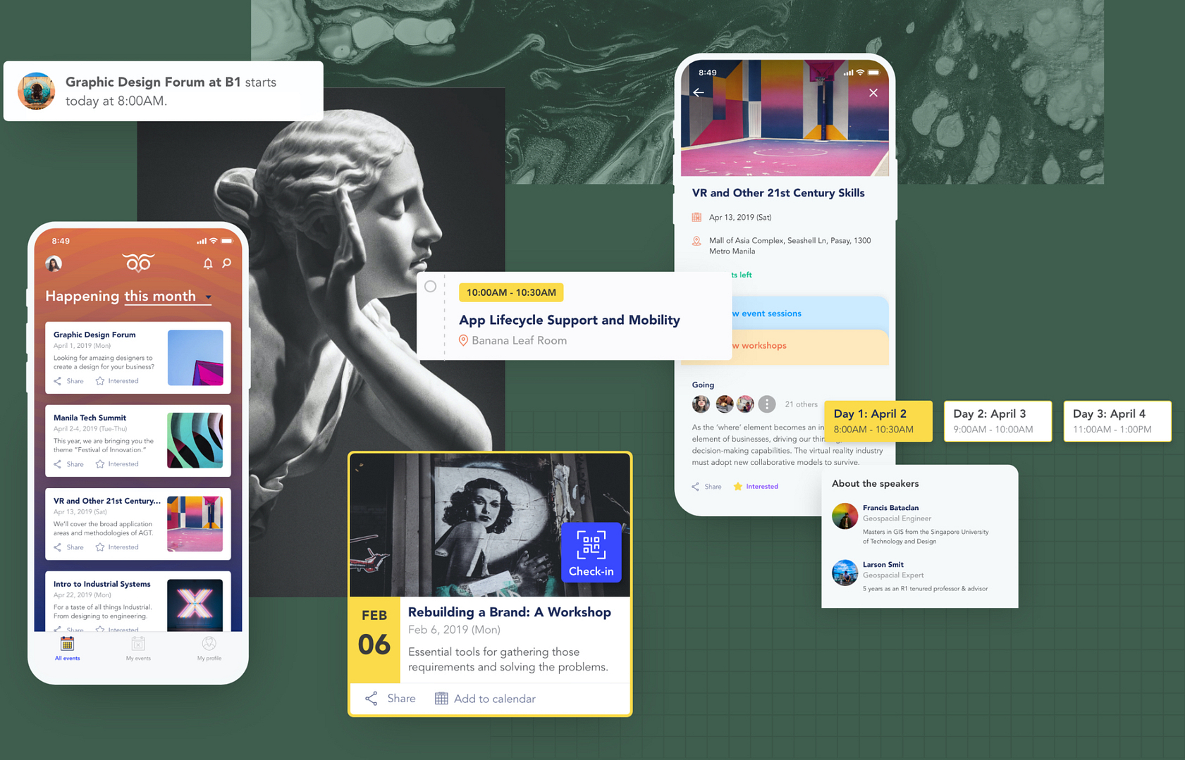
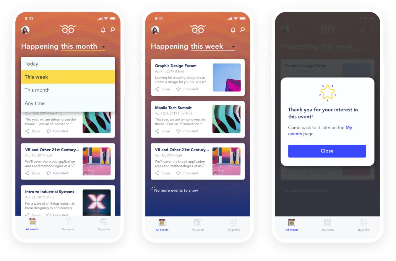
Users would be greeted with the events for the month (by default), but would also be able to filter events for the day or week.
They can also click on interested to bookmark the event for future reference. All saved events end up on the "My events" tab.
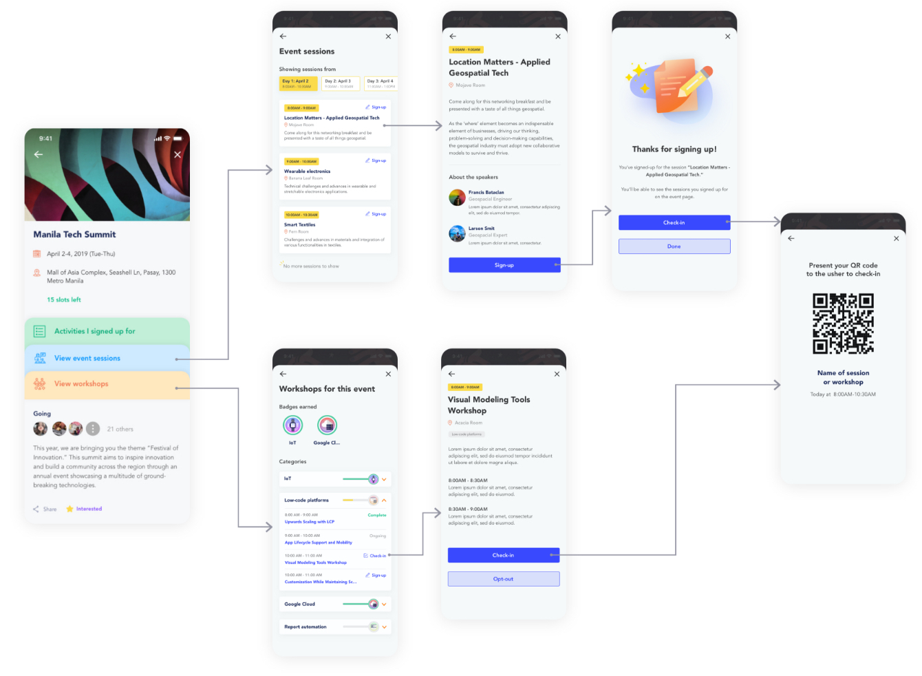
On the event page, the user can sign-up for activities (sessions and workshops) once they’ve registered for the event. Since events may span several days with varying time slots each day, there is a horizontal scroll on the inner pages to switch between dates.
Activities you sign up for are all in one convenient tab, ready for event day.
Sign-up for sessions & workshops
"Activities" are a subset of the greater event. Sessions are like a class, while workshops would involve more hands-on work and applying what was learned.
To encourage active participation (looking at you, Rizza) progress points, and in effect badges, can only be earned when workshops are completed.
On event day
Easily find activities you signed up for
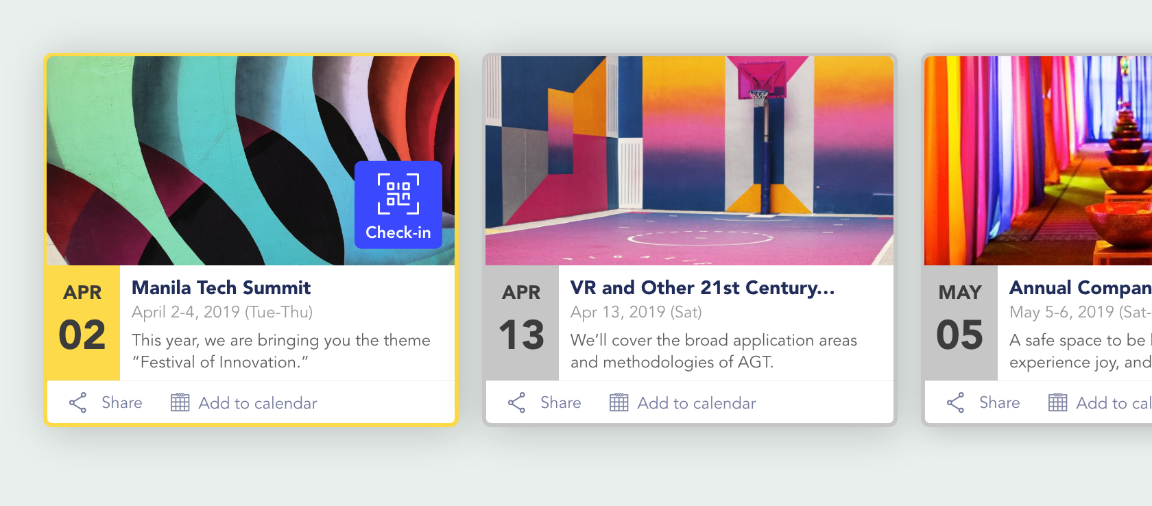
All upcoming events and events marked as interested can be found on the “My events” tab. Upcoming events are arranged by the closest date.
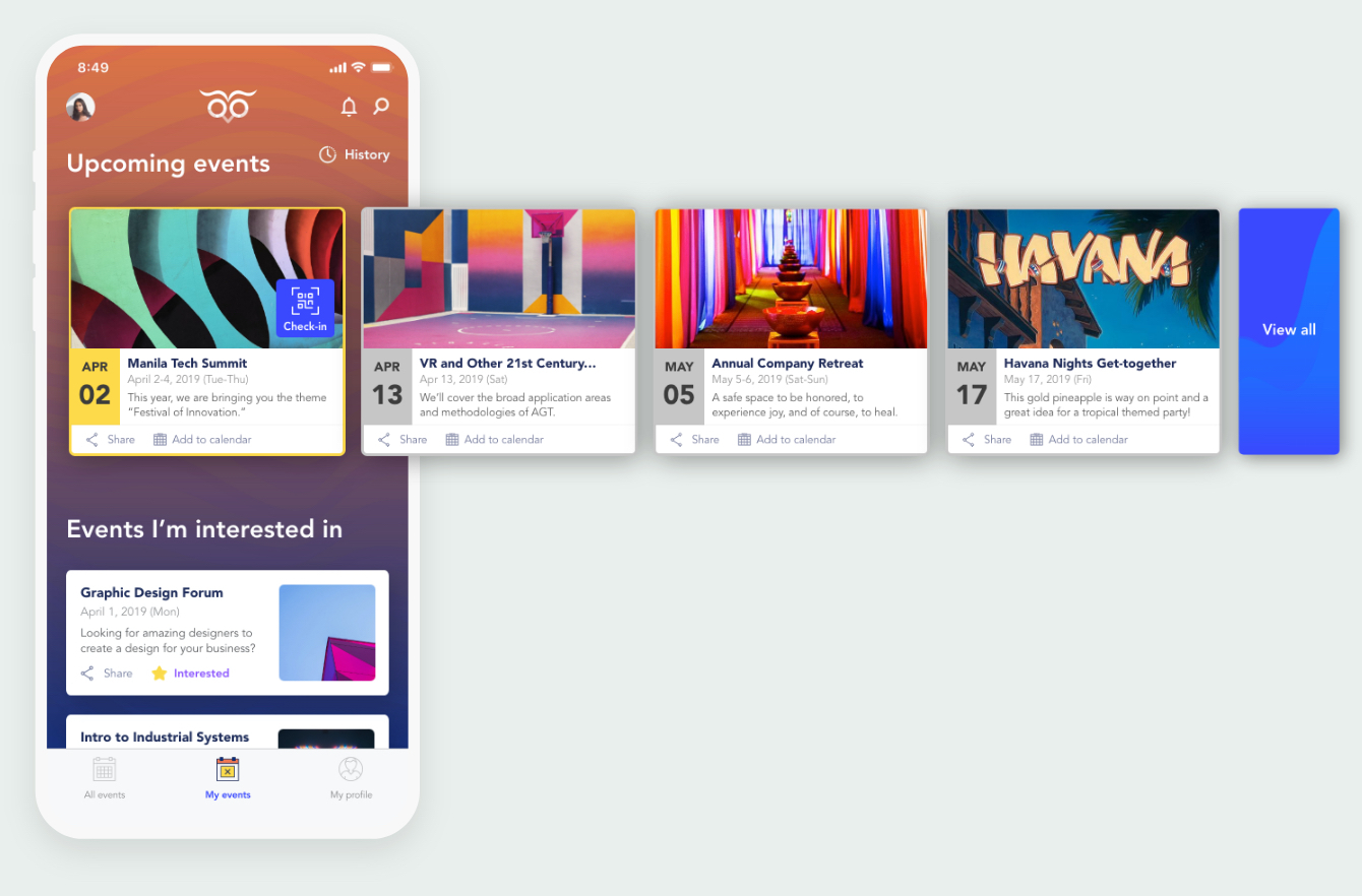
Upcoming events will have an "Add to calendar" option for Google Calendar, which was what almost all employees used to set up meetings or events.
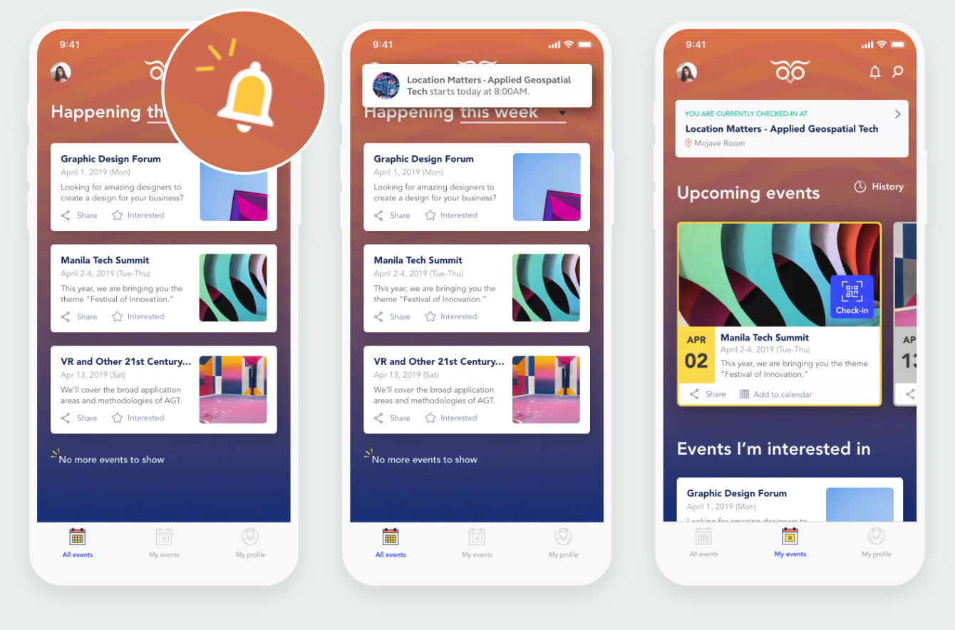
Events happening today are highlighted and have a quick access check-in button that opens up the phone camera so the user can scan the QR code at the event's reception.
Notifications: never be late again
Push notifications (or in-app if the app is open) tell the user when events or activities they signed up for are about to start. They'll receive a notification 30 minutes before an event or 20 minutes before a session or workshop.
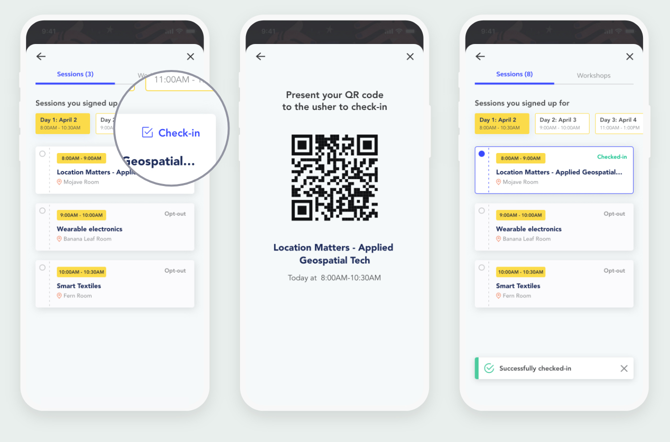
Check-in with one tap
To check into activities, the user goes into the event page and taps check-in on the activity card. A QR code pops up for the event ushers to scan and record an event-goer's attendance. This will also give them access to questions and feedback forms at the end of activities.
After activities
Don't forget to send feedback!
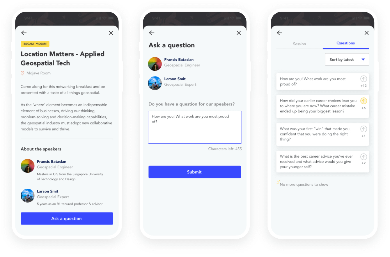
Towards the end of a session attendees can send in their questions for speakers to answer.
Once an usher marks an activity as done, the attendees receive a message letting them know the workshop or session they attended is over and that they may send feedback through the app.
Ask experts & upvote questions that matter to you
Questions can be asked at any time throughout the activity. To ensure question quality even without a host, attendees can upvote questions they want to see answered. Questions are arranged by latest for event-goers, and by number of upvotes for experts.
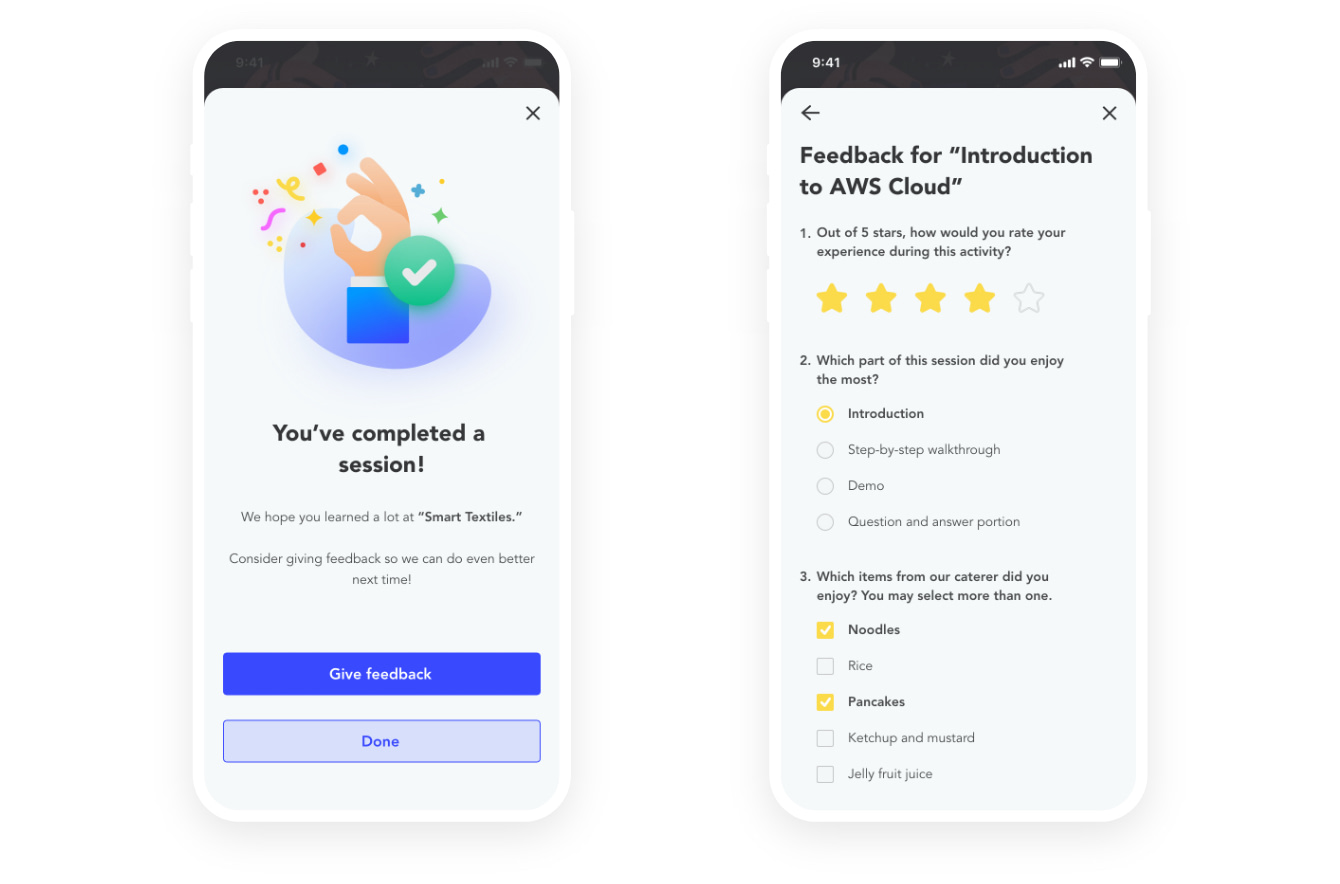
Send feedback
Once an activity has concluded, participants are asked to consider giving feedback. This was meant to gather points for improvement for the speaker, event environment, and also get a pulse check on users' overall satisfaction with the event app.
Visualize skill proficiency with badges
Initially workshops will show all categories at zero progress. The progress trackers will begin to fill as an event-goer participates in activities. If a category is maxed out, they earn a badge.
The use of colors and visual feedback puts less pressure on non-native speakers.
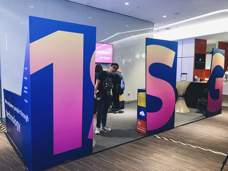
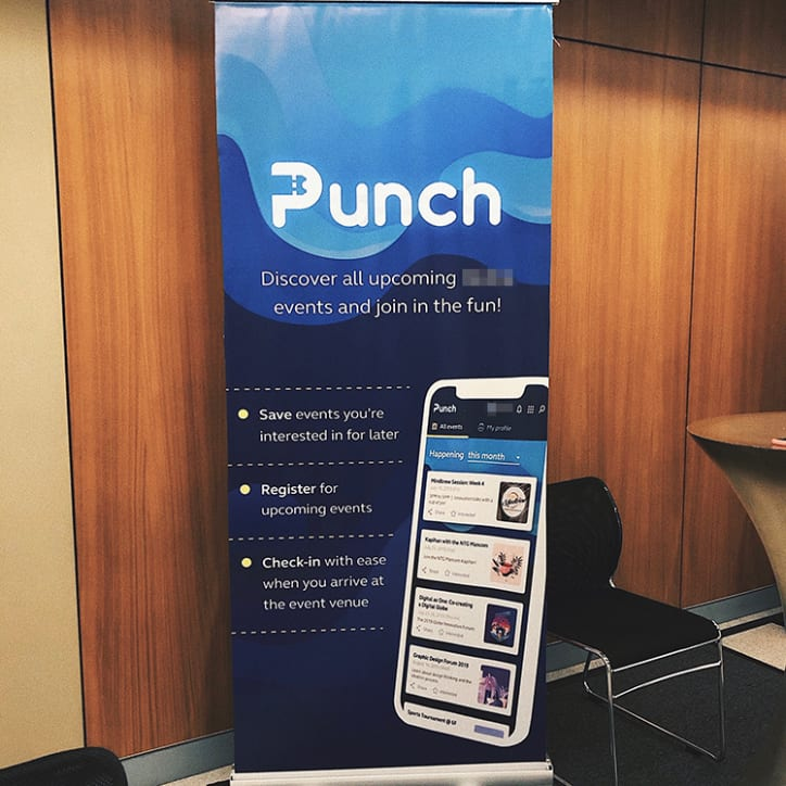
The big debut
The version I designed was released with its original branding during a yearly innovation forum. The name and branding were changed for this case study.
Fun fact: this also happened to be my final day at this job. (I got to be an usher for the first time!)
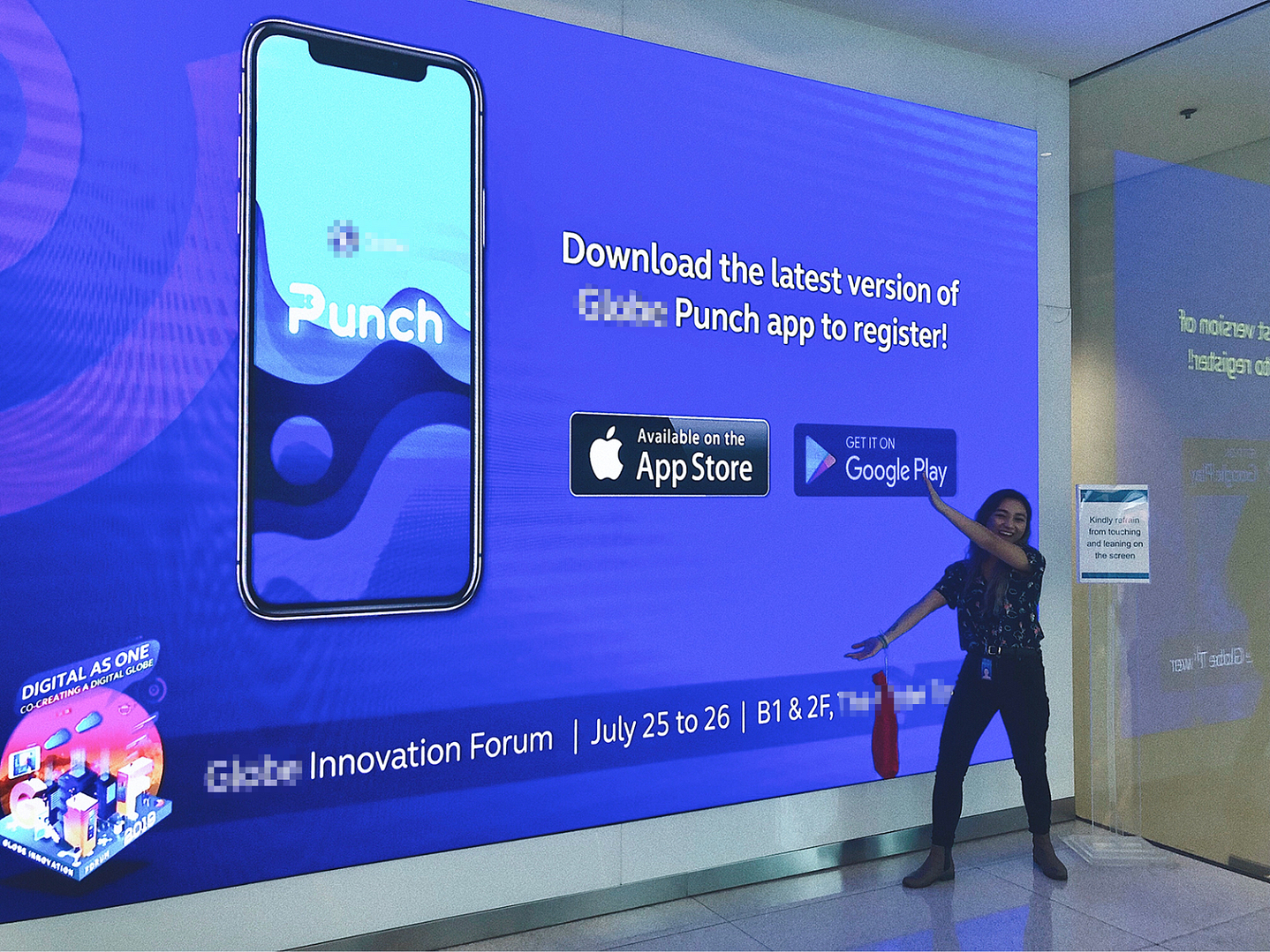
Me being excited about my design being on the big screen. I somehow scrambled together the tarpaulin banner and standees seen here the day before.
Outcome & retrospective
Since this was my final project as a member of The Telecom's Enterprise Design team, I left a part of my heart in it. I came into this place raw and semi-defined. This was where I learned to listen for empathy, hone in on my common sense, and believe in my decisions as a designer. I wasn't leaving without one final tribute.
01/
On multi-tasking and time management
The project was met with a lot of time and resource constraints (we literally only had one developer). We had to let go of some of the more superficial elements like feedback animation.
We still managed to get ahead of the timeline towards the end and made the decision to add functionalities over embellishments.
02/
"Lost our lease, going-out-of-business" method
This was not an "official" project, meaning it did not come with any budget. I'm talking none. Nada. Zilch.
Luckily our 3-man team worked on the same floor, so many meetings were held ad hoc in breakrooms or simply walking up to each other's desks for quick alignments. It was a refreshing change from the flurry of meeting invites and back and forth emails that plagued some of my previous projects.
Post design testing was done through Steve Krug’s “Lost our lease, going-out-of-business-sale usability testing” method from his book, Don’t Make Me Think.
03/
Integrating facial recognition
The technology was very new at the time, so this was all very exciting. Facial recognition was carried on the app in place of the QR code. (For safety reasons, this was only done for current employees). The app was used to check users into events, as well as gather data on employee participation.
💌OPEN MAILBOX
ALEXINE MARTINA ©
Made for alexinemartina.com by Alex
